© Robbie Palmer 2026
World Jewish Relief
Brand Refresh
World Jewish Relief is a humanitarian organisation established in 1933, delivering life-saving and life-changing support to people in crisis across the globe.
The brief was to refresh the brand, retaining its core elements while giving them renewed clarity and relevance.
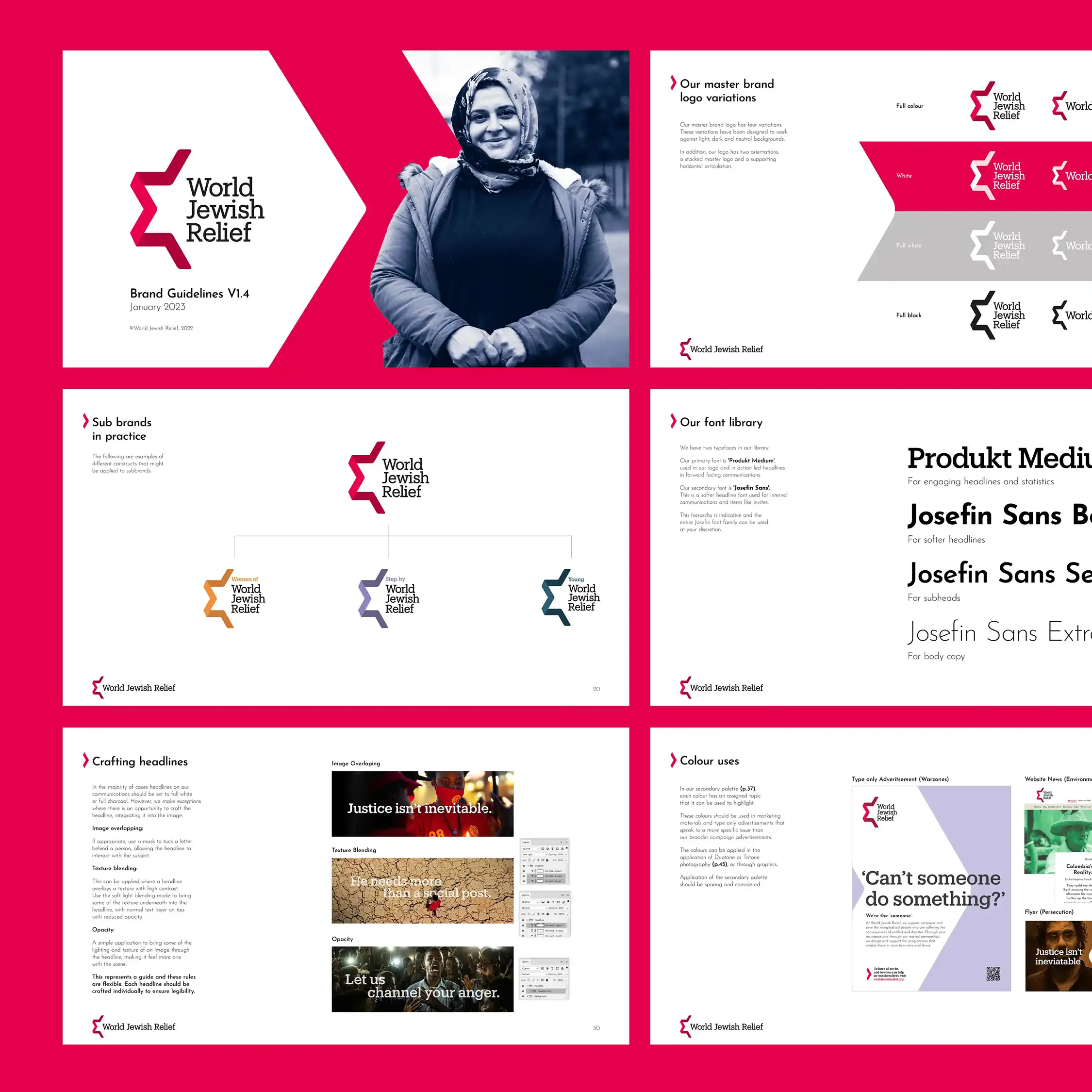
I refined the initial logo concept, defined the design system and application rules, and developed the final brand guidelines.
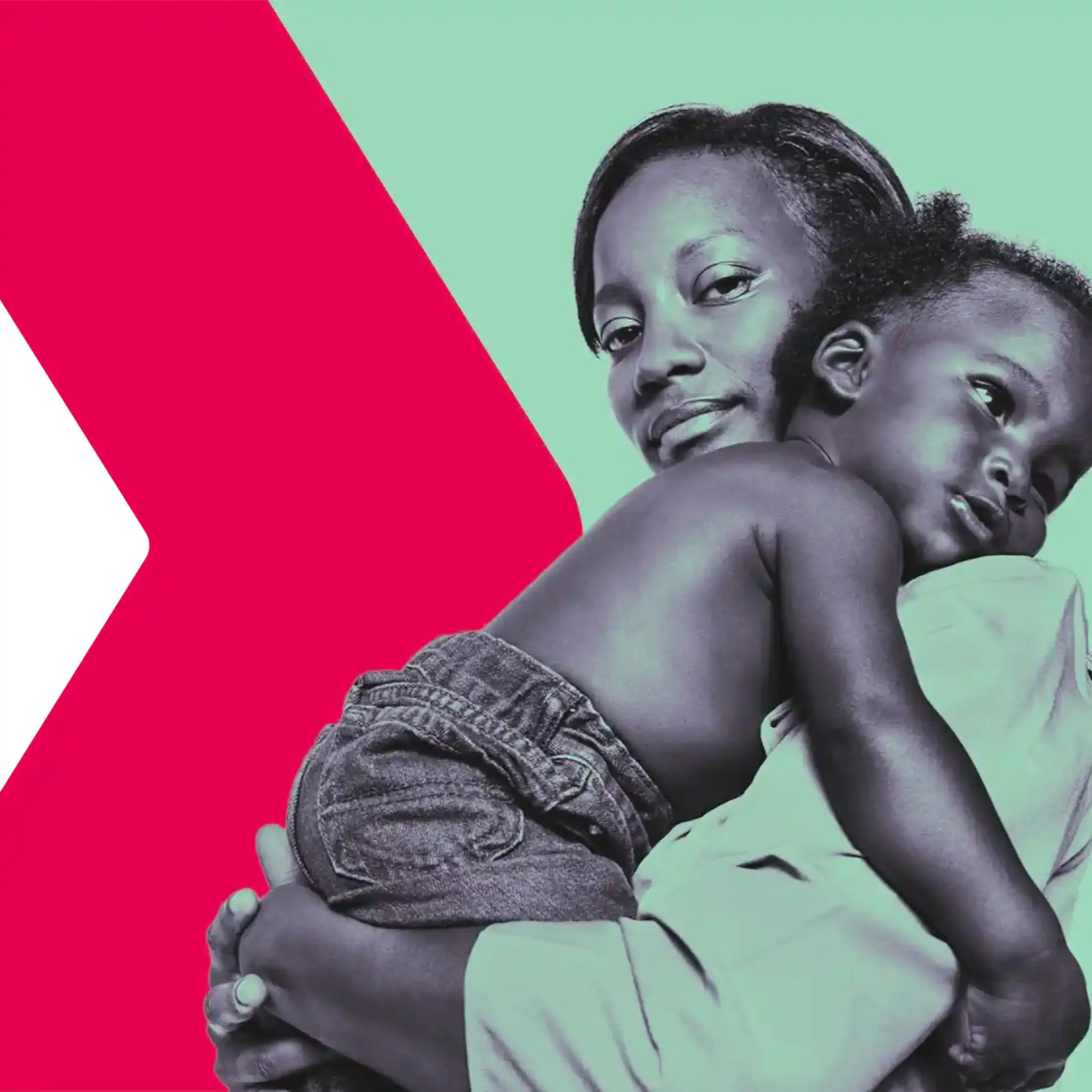
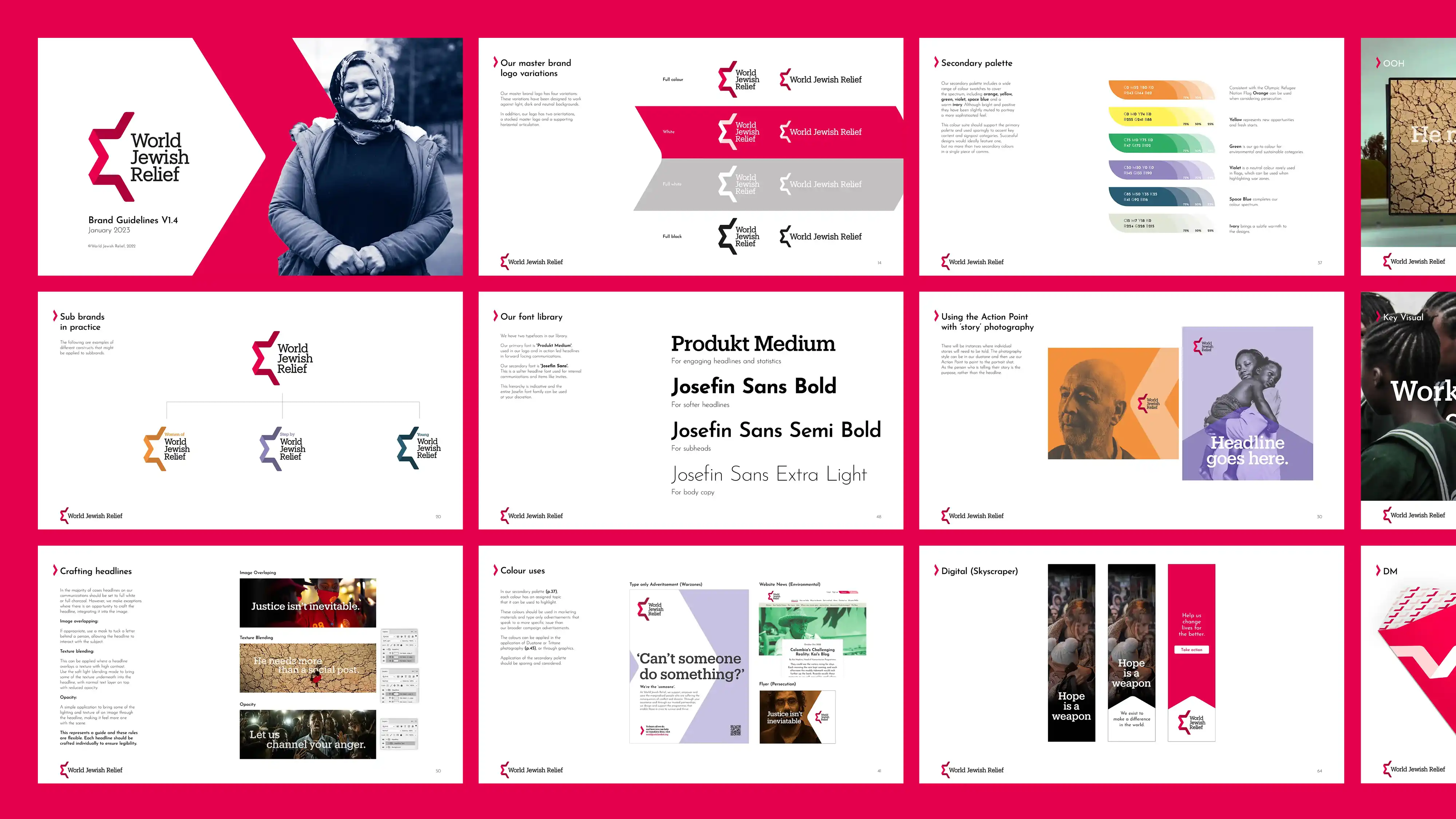
The Star of David-inspired mark was refined into a more confident, contemporary symbol.
By simplifying its structure and introducing a softer red palette, a forward-pointing arrow was revealed, creating a versatile asset across the identity.
The original sans-serif typeface was replaced with a slab serif, reinforcing a sense of heritage and authority.
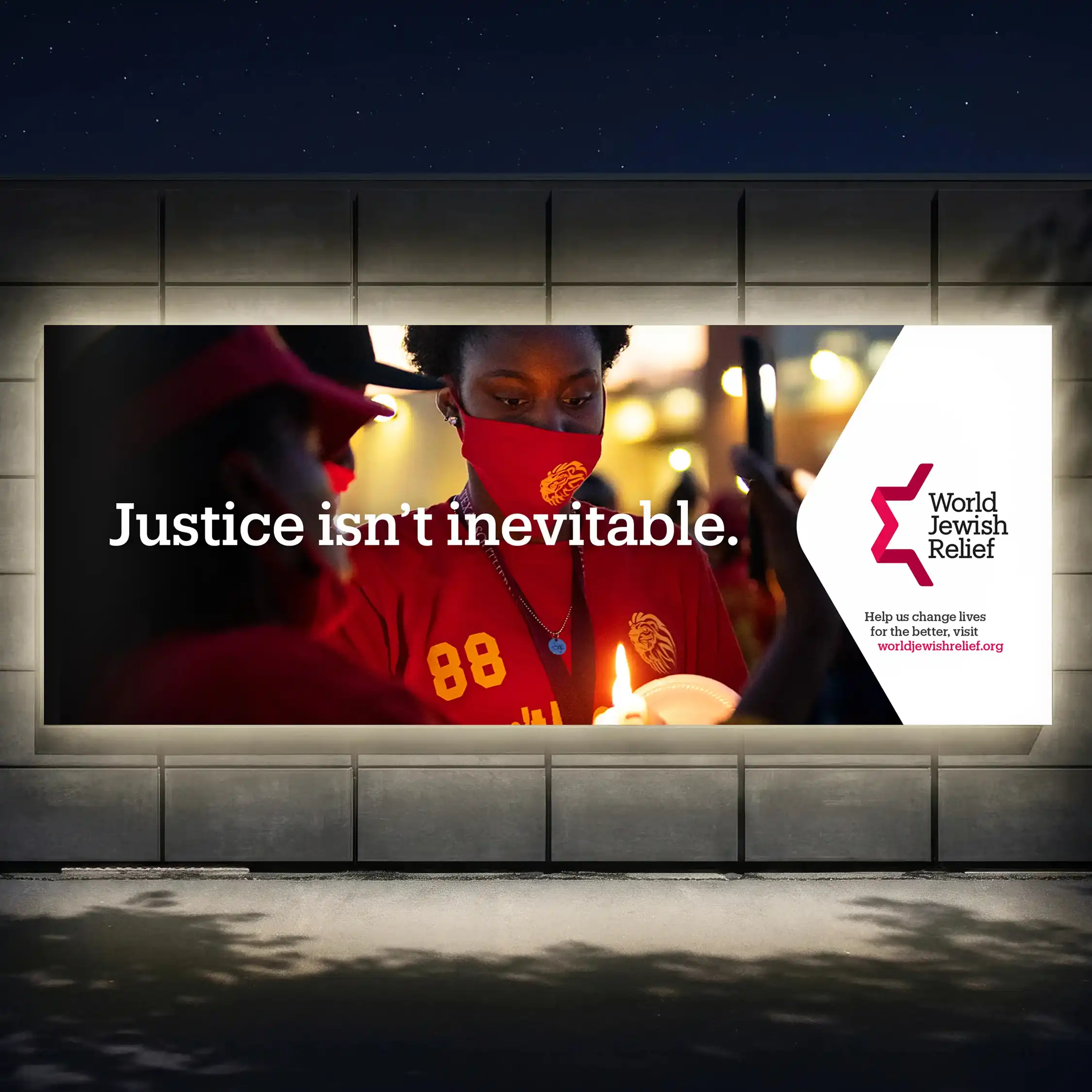
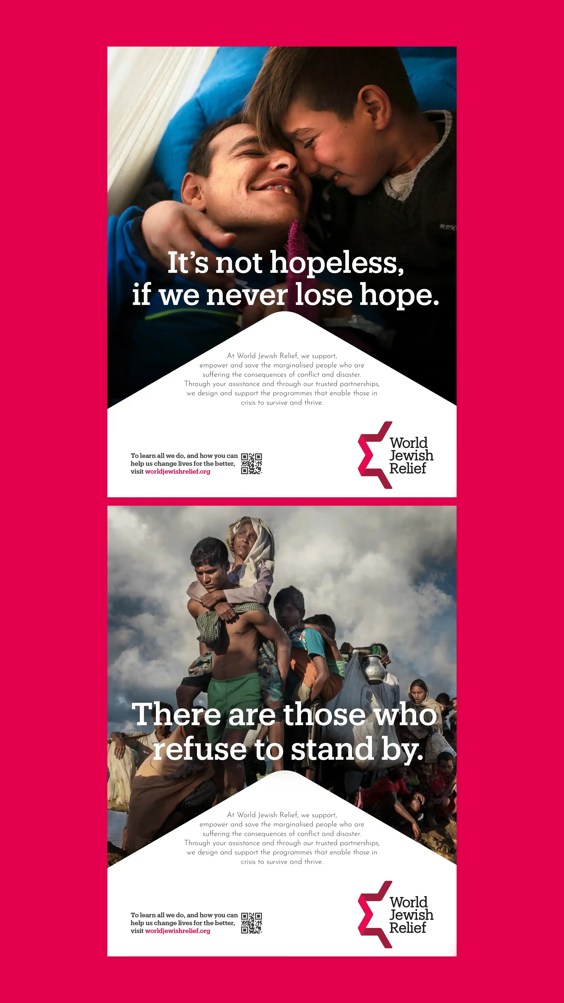
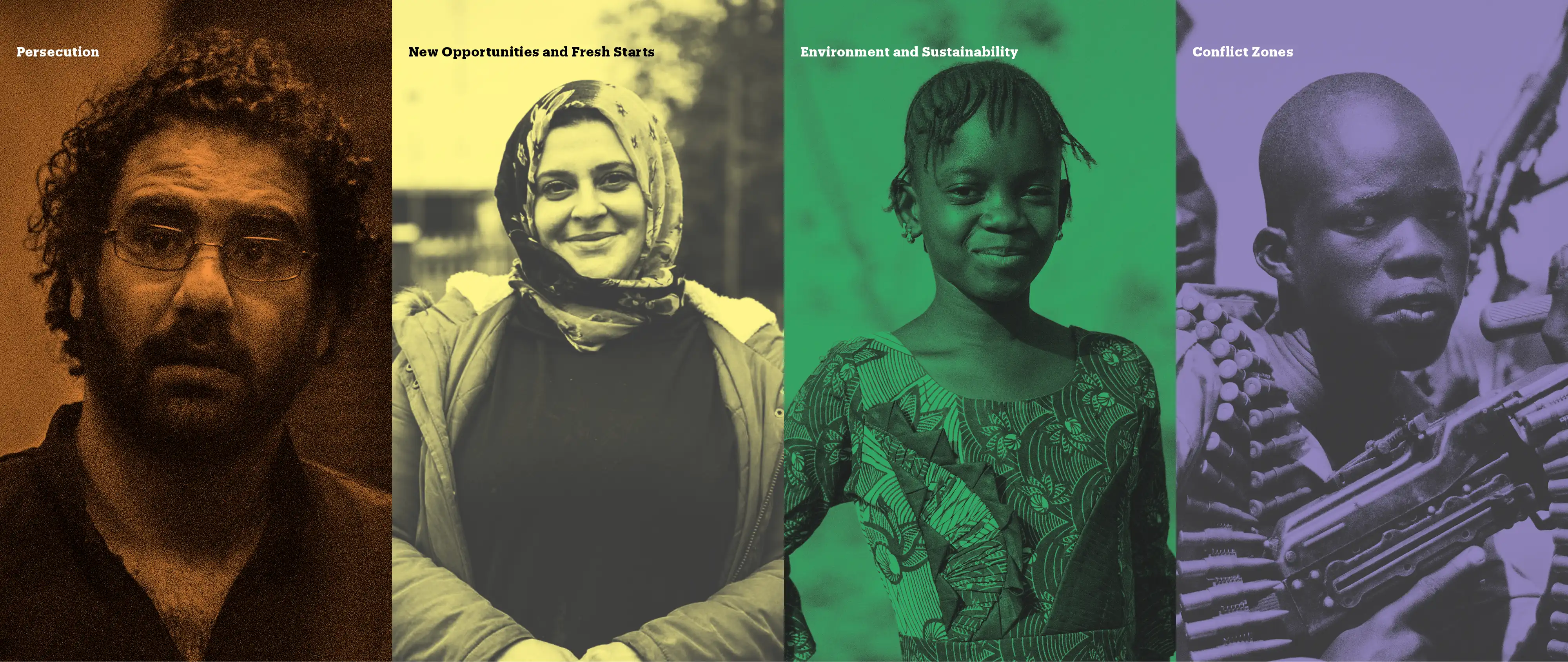
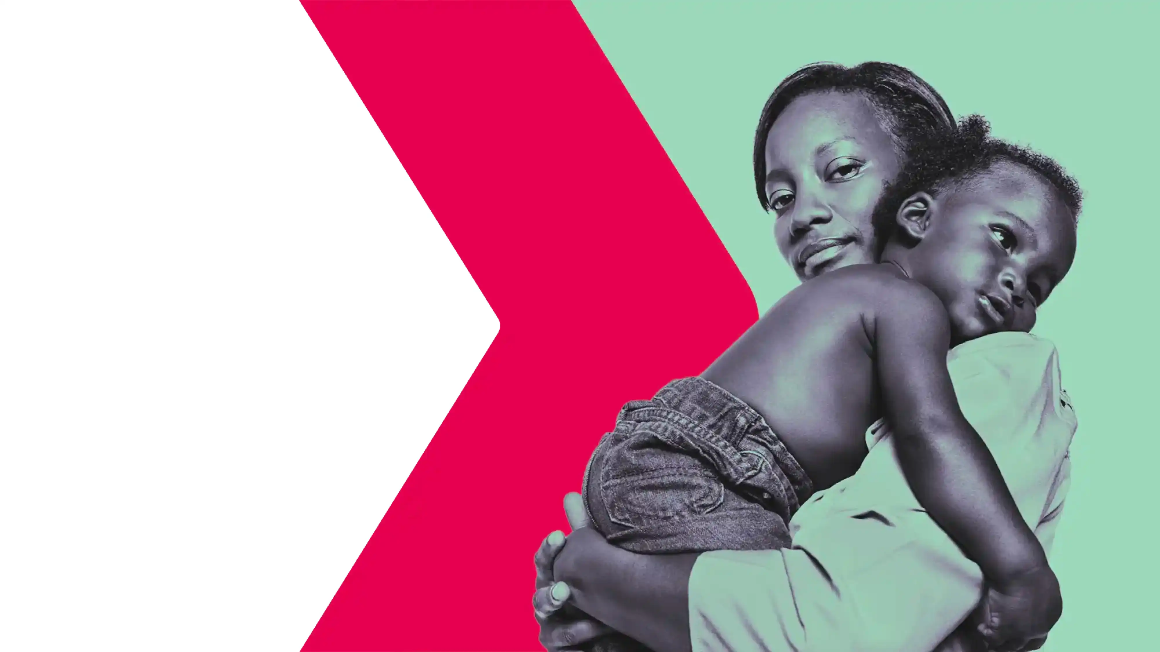
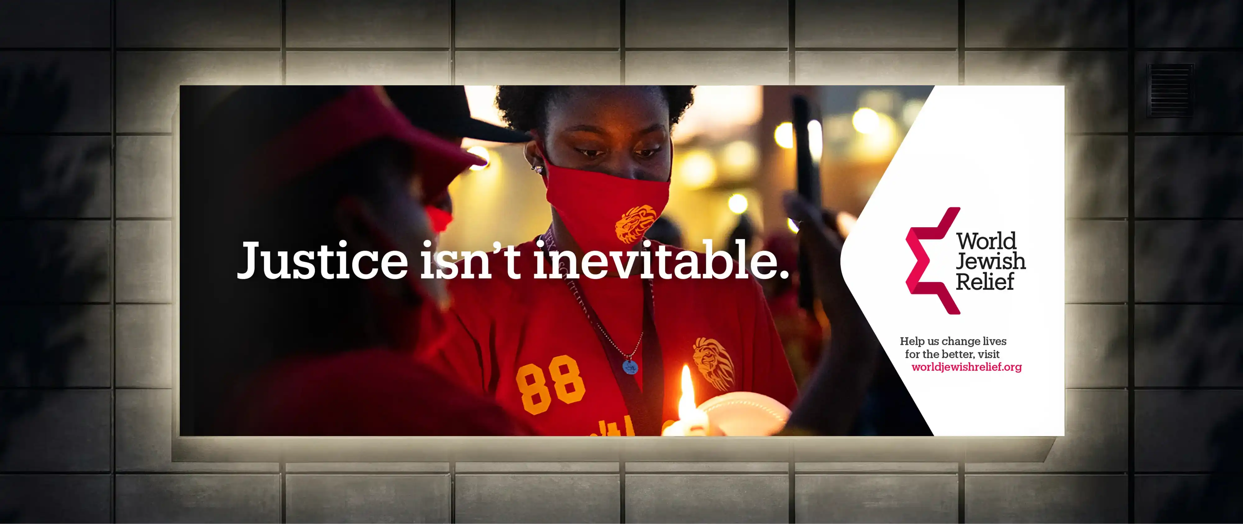
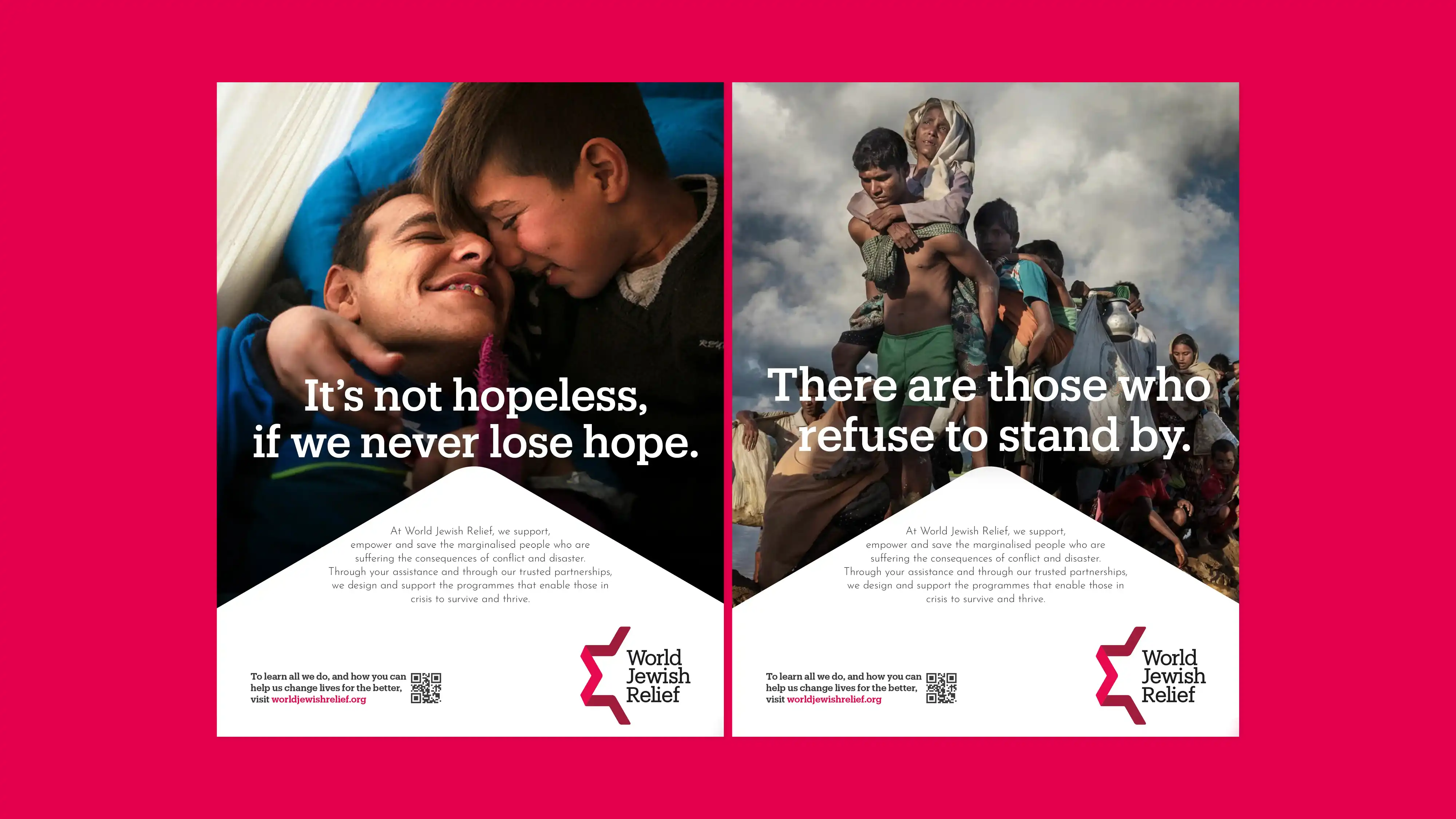
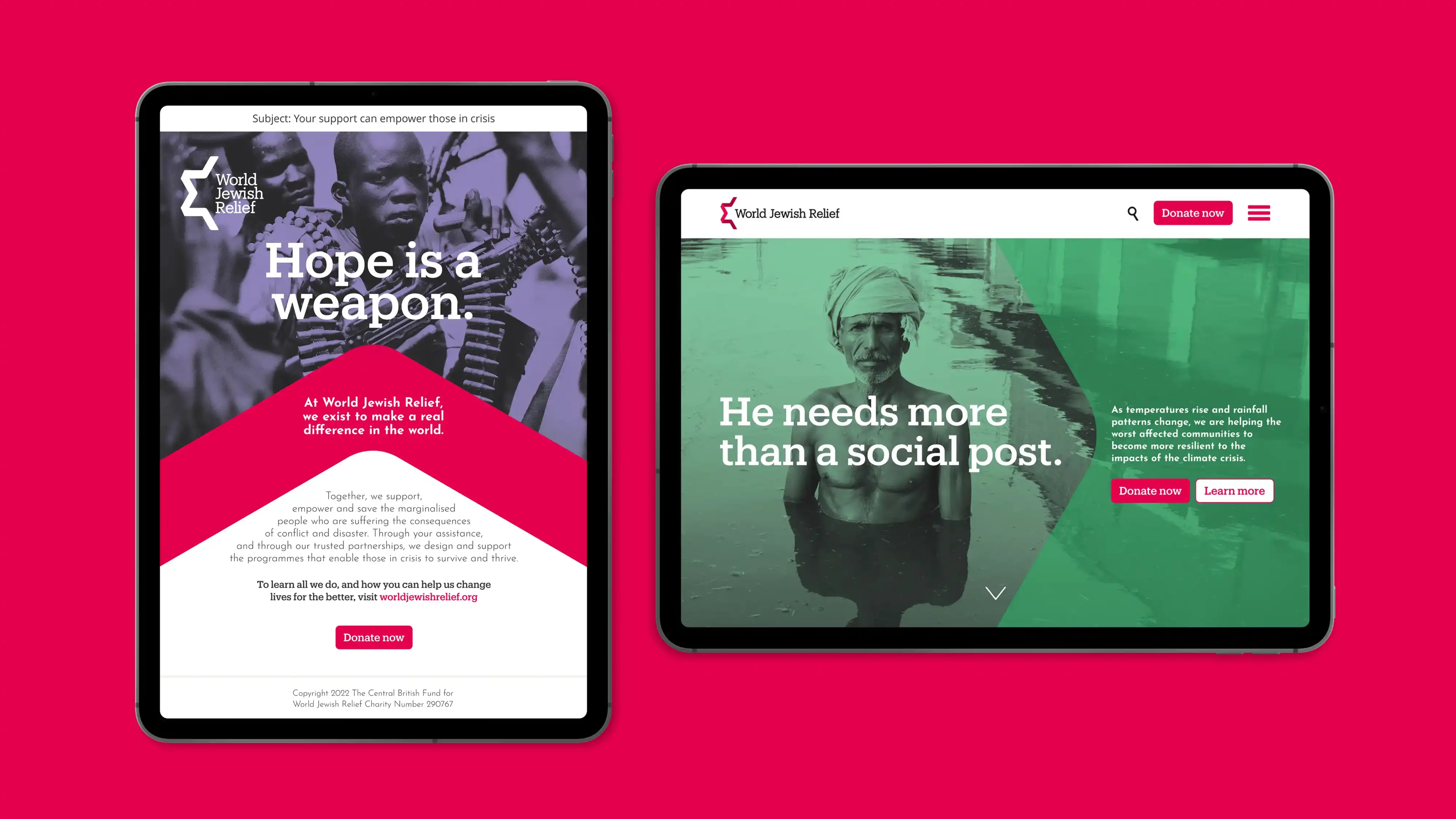
Alongside the documentary-style “On the Ground” photography, a secondary “Story” style was introduced, focusing on subjects with minimal surrounding context.
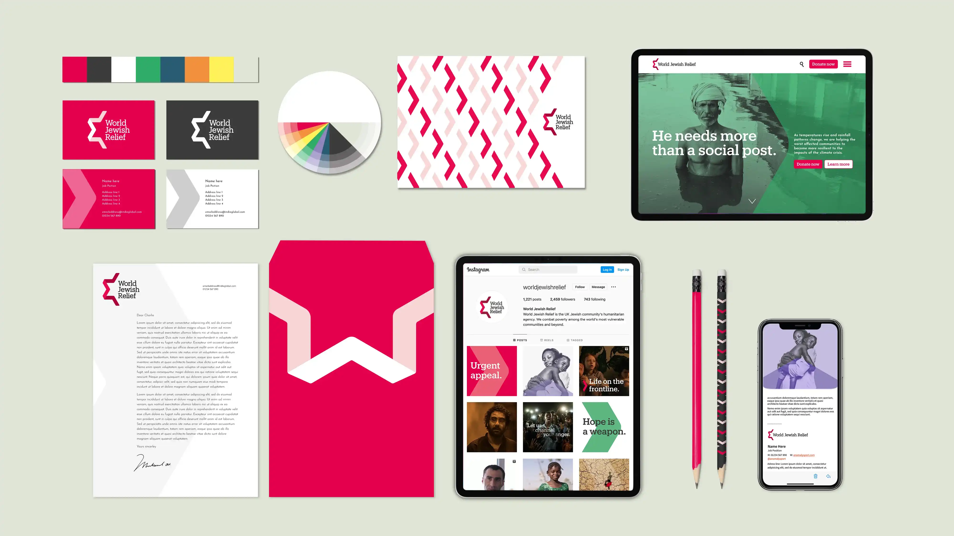
The colour palette was refreshed to be bright and optimistic, with each colour linked to a specific theme and applied through gradient map treatments.


MultidisciplinarySenior Designer
© Robbie Palmer 2026

Brand guidelines

Stationery

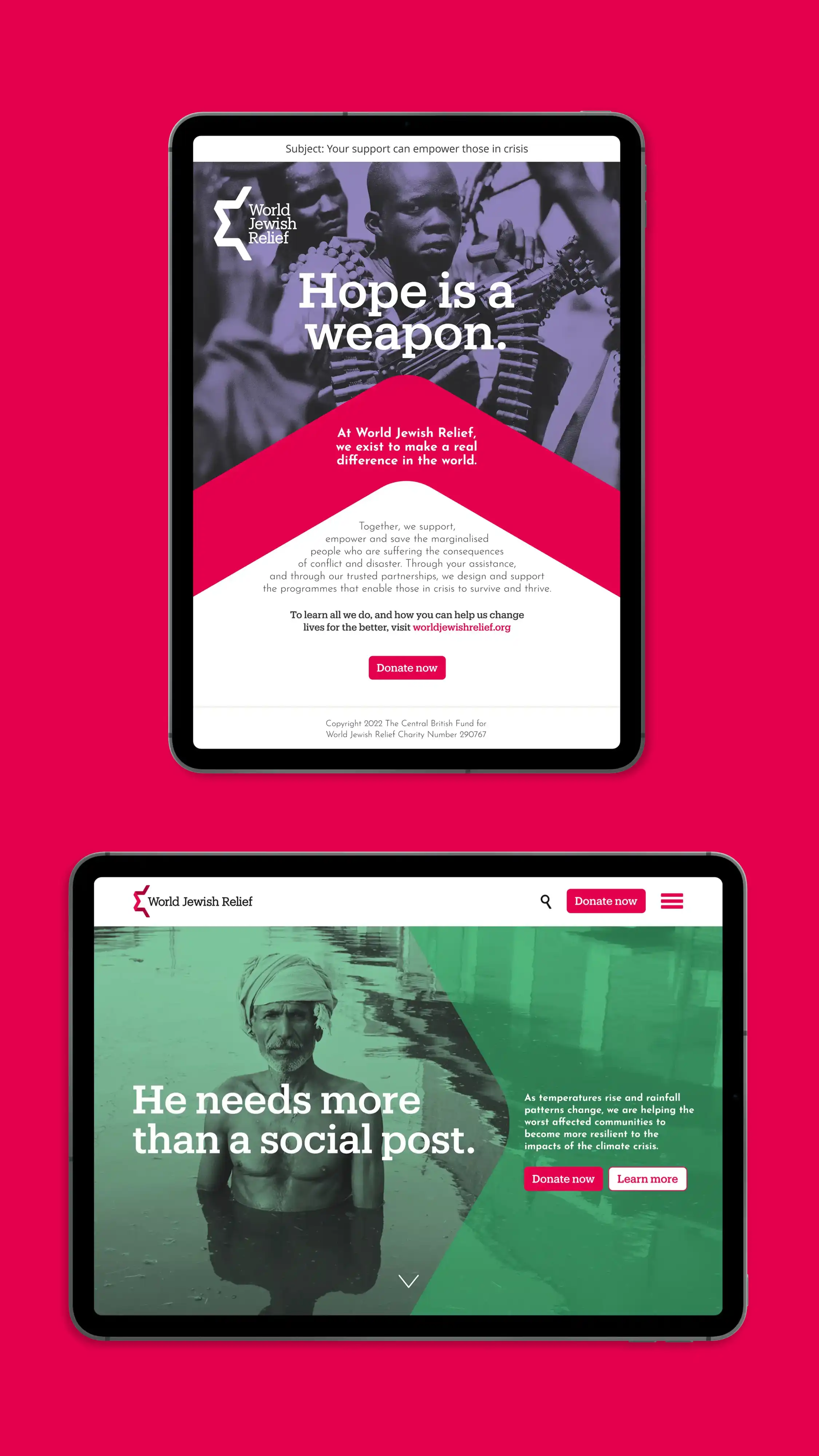
EDM and landing page

Story photography
Alongside the documentary-style “On the Ground” photography, a secondary “Story” style was introduced, focusing on subjects with minimal surrounding context.
The colour palette was refreshed to be bright and optimistic, with each colour linked to a specific theme and applied through gradient map treatments.
Adcepts

OOH

Logo
The Star of David-inspired mark was refined into a more confident, contemporary symbol.
By simplifying its structure and introducing a softer red palette, a forward-pointing arrow was revealed, creating a versatile asset across the identity.
The original sans-serif typeface was replaced with a slab serif, reinforcing a sense of heritage and authority.

Key art
World Jewish Relief
Brand Refresh
World Jewish Relief is a humanitarian organisation established in 1933, delivering life-saving and life-changing support to people in crisis across the globe.
The brief was to refresh the brand, retaining its core elements while giving them renewed clarity and relevance.
I refined the initial logo concept, defined the design system and application rules, and developed the final brand guidelines.
© Robbie Palmer 2026

Brand guidelines

Stationery

EDM and landing page
Story photography
Alongside the documentary-style “On the Ground” photography, a secondary “Story” style was introduced, focusing on subjects with minimal surrounding context.
The colour palette was refreshed to be bright and optimistic, with each colour linked to a specific theme and applied through gradient map treatments.

Adcepts

OOH
Logo
The Star of David-inspired mark was refined into a more confident, contemporary symbol.
By simplifying its structure and introducing a softer red palette, a forward-pointing arrow was revealed, creating a versatile asset across the identity.
The original sans-serif typeface was replaced with a slab serif, reinforcing a sense of heritage and authority.
Key art
World Jewish Relief
Brand Refresh
World Jewish Relief is a humanitarian organisation established in 1933, delivering life-saving and life-changing support to people in crisis across the globe.
The brief was to refresh the brand, retaining its core elements while giving them renewed clarity and relevance.
I refined the initial logo concept, defined the design system and application rules, and developed the final brand guidelines.
