© Robbie Palmer 2026
Sodali & Co.
Brand Identity
Sodali & Co is a global stakeholder advisory firm formed following the rapid acquisition of twelve businesses.
The company needed to reposition itself as a modern consultancy capable of competing with established global players, uniting a group of companies under a single identity while communicating clarity, authority and trust within a conservative sector.
I led the development of the visual identity, from concept through to final guidelines, defining the Iris device and the wider design system, including typography, colour and layout principles, to support a global rollout.

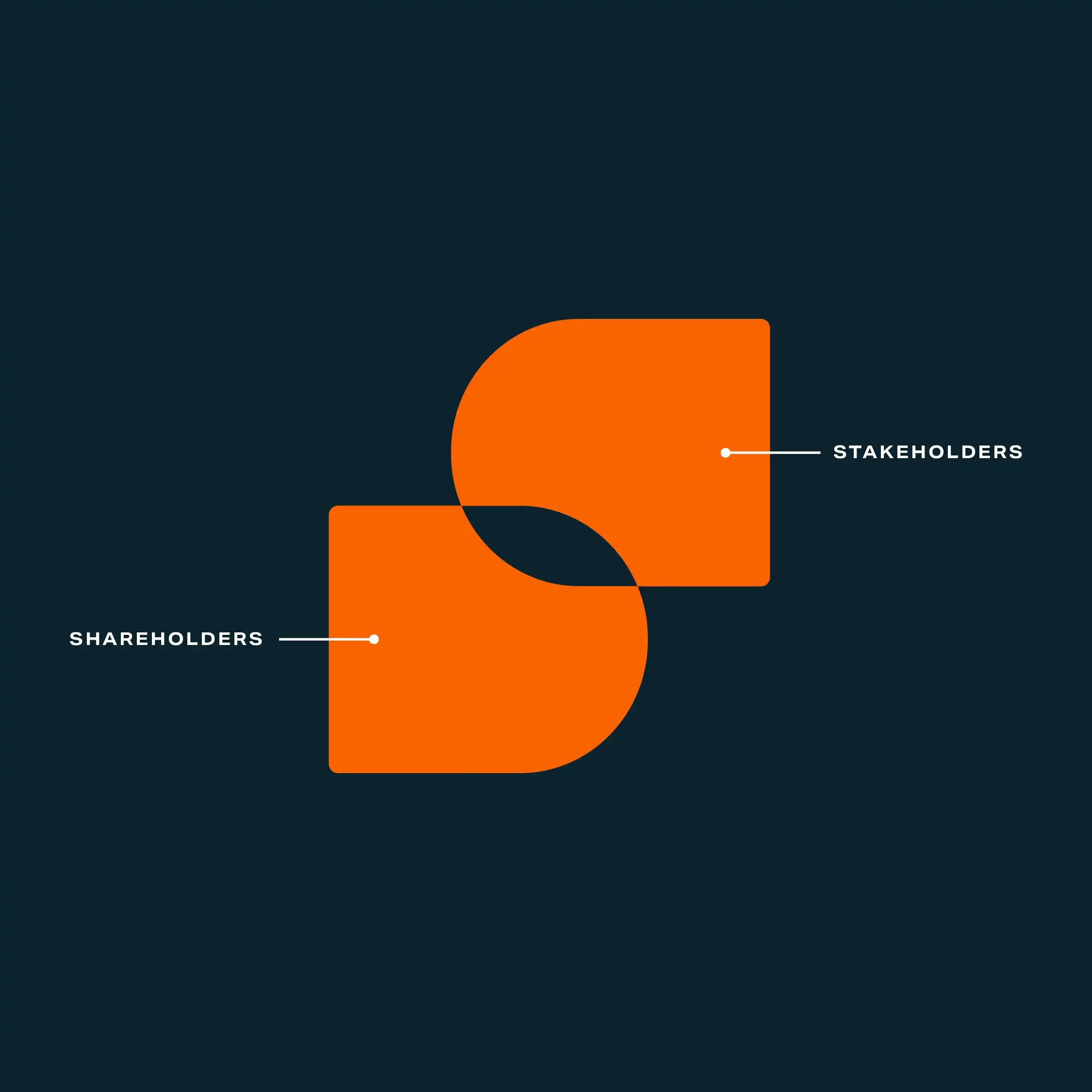
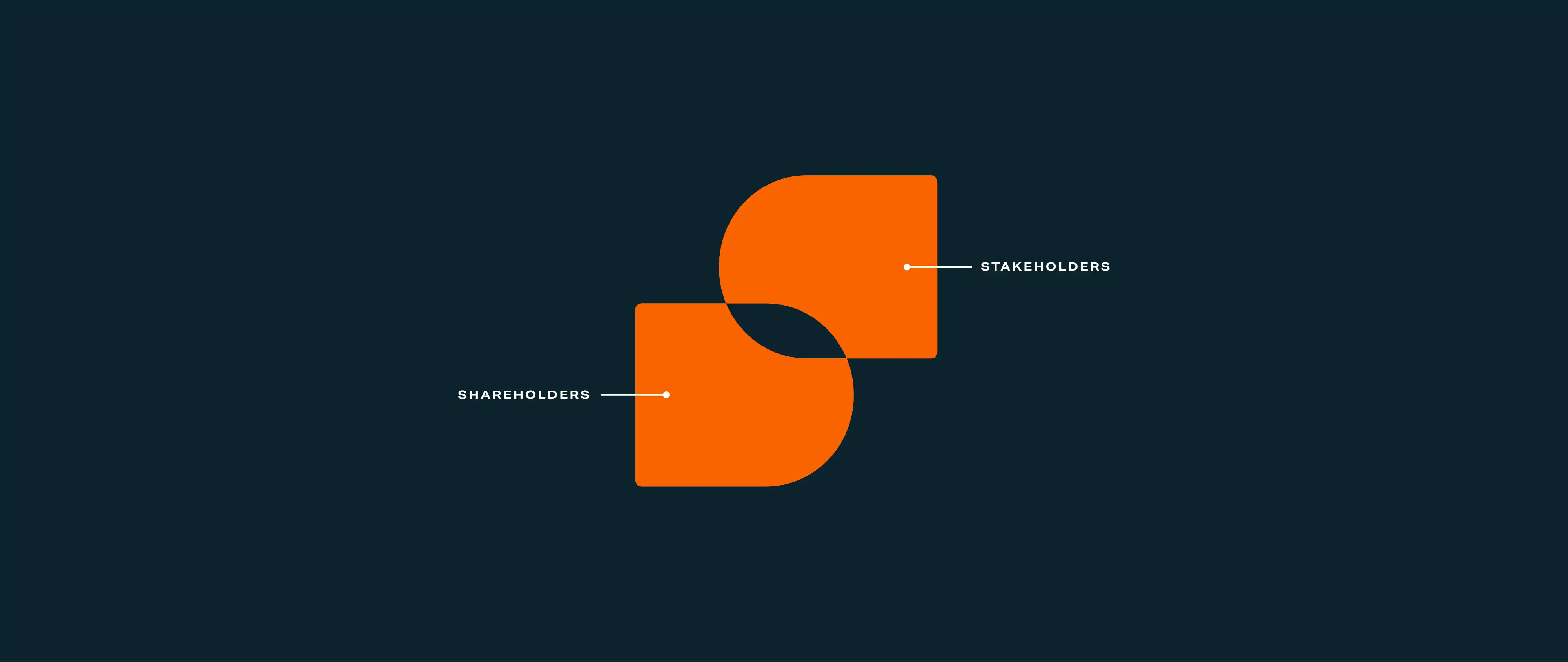
I developed a visual system built around alignment, bringing competing stakeholder and shareholder interests together around a single point of focus.
This idea is expressed through a central negative-space device known as the “Iris”.
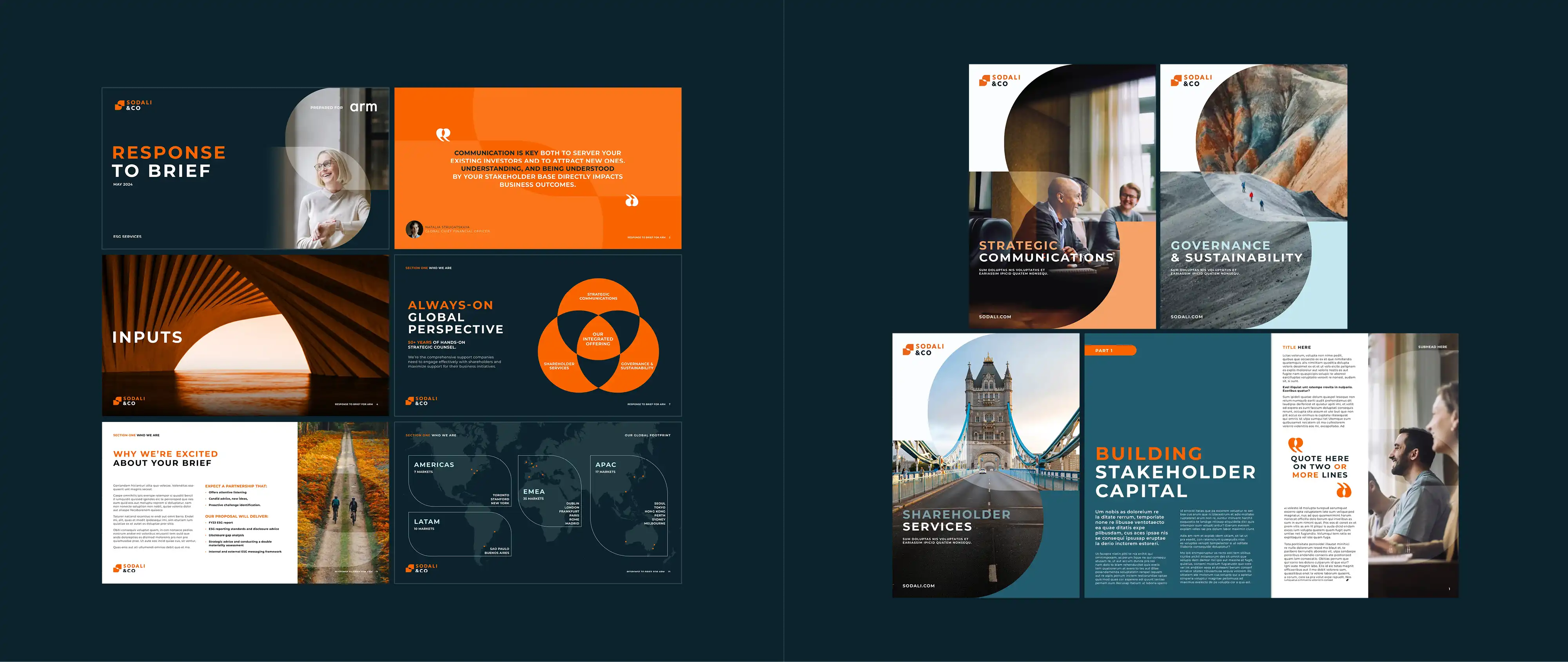
A contemporary sans-serif positions the brand alongside global consultancies.
A restrained blue and white palette signals trust, with orange used for moments of emphasis and distinction.
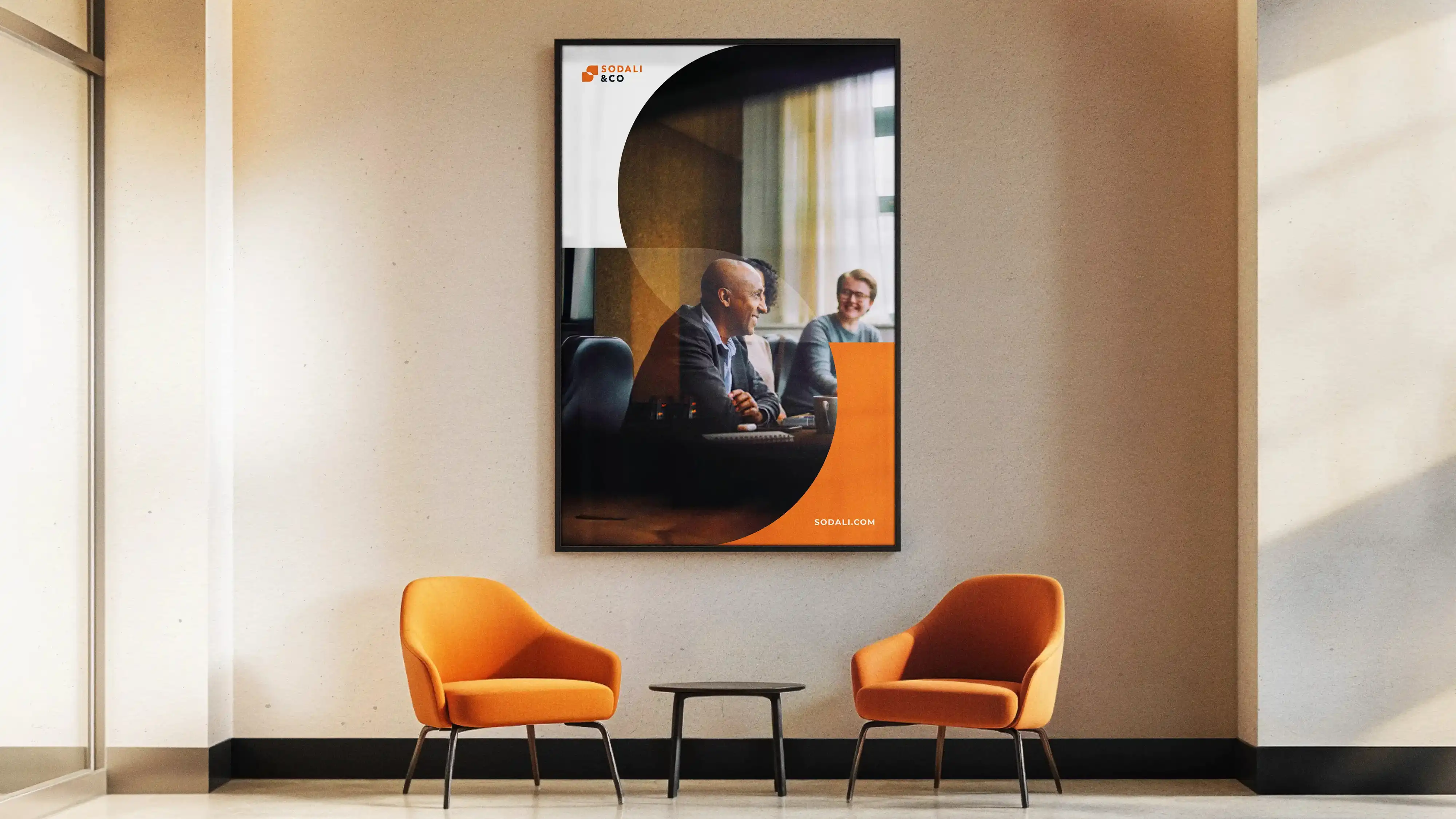
The Iris acts as a flexible device across layouts, framing content and guiding composition.


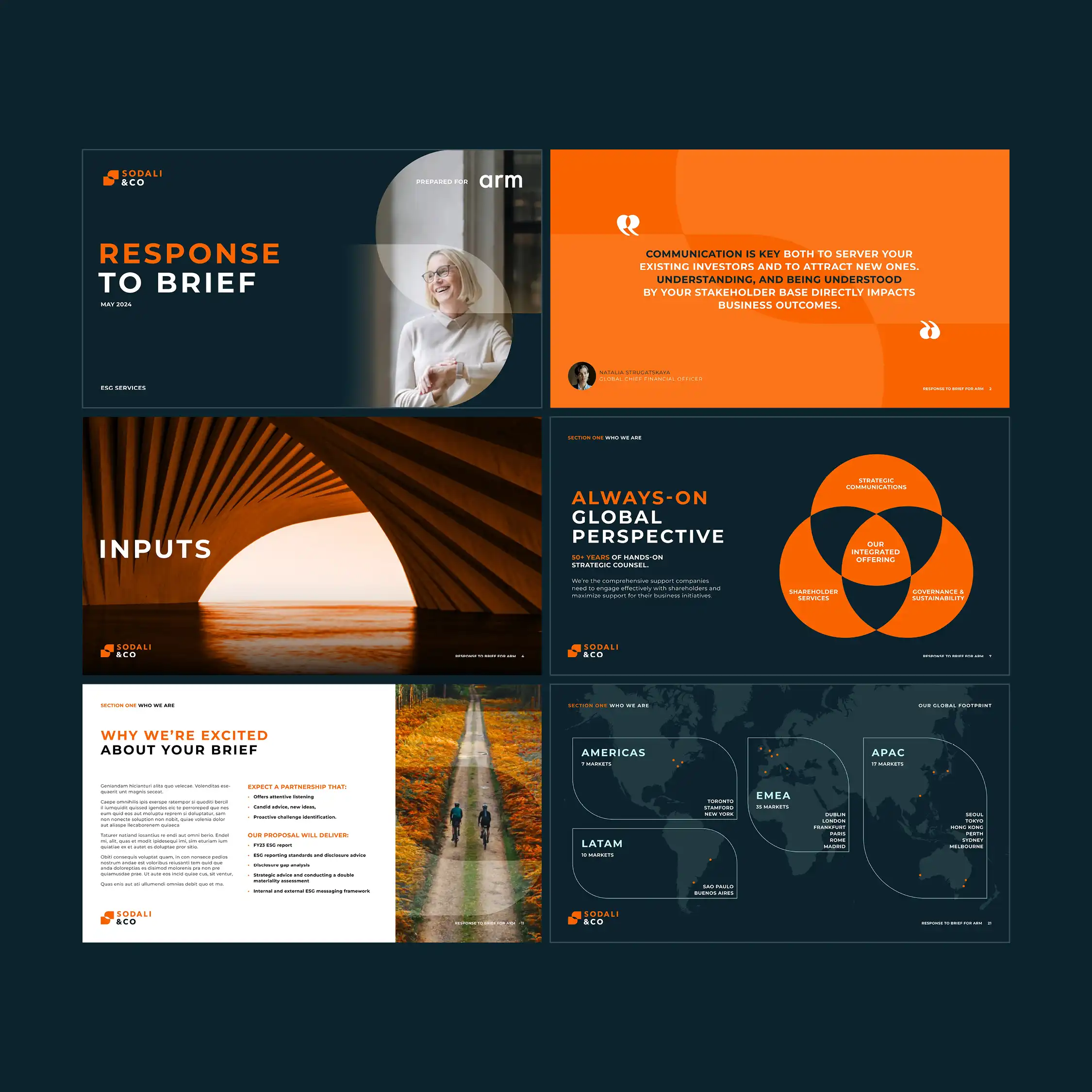

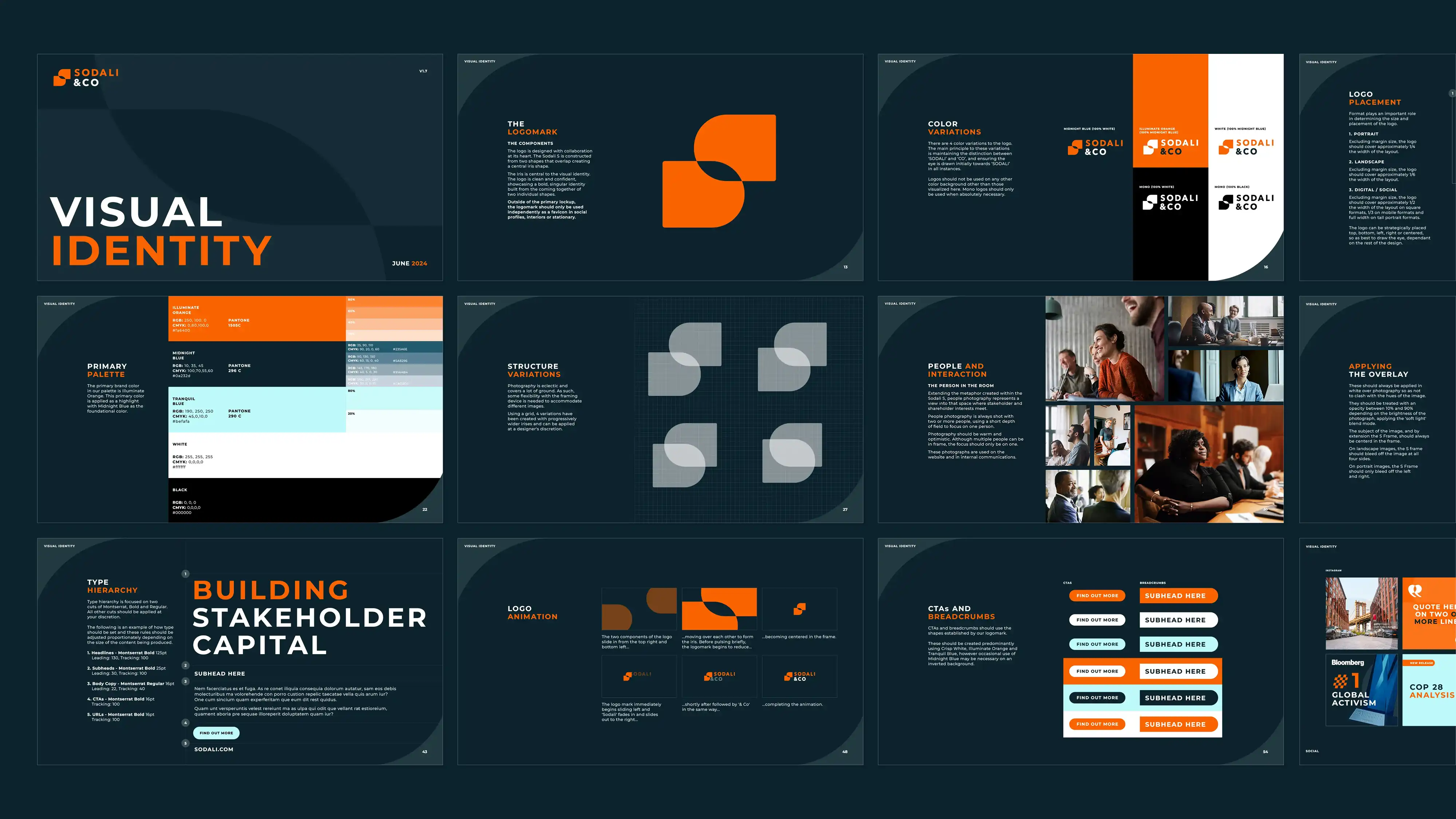
Sodali & Co launched successfully across 19 offices in 12 markets as a company united under one flag - with a distinctive visual identity, and a new brand architecture that organised their services into distinct practice areas, providing them with an operating model that enabled both acquisition and cross-sell.

MultidisciplinarySenior Designer
© Robbie Palmer 2026
Sodali & Co launched successfully across 19 offices in 12 markets as a company united under one flag - with a distinctive visual identity, and a new brand architecture that organised their services into distinct practice areas, providing them with an operating model that enabled both acquisition and cross-sell.

Brand guidelines
Pitch decks and brochures
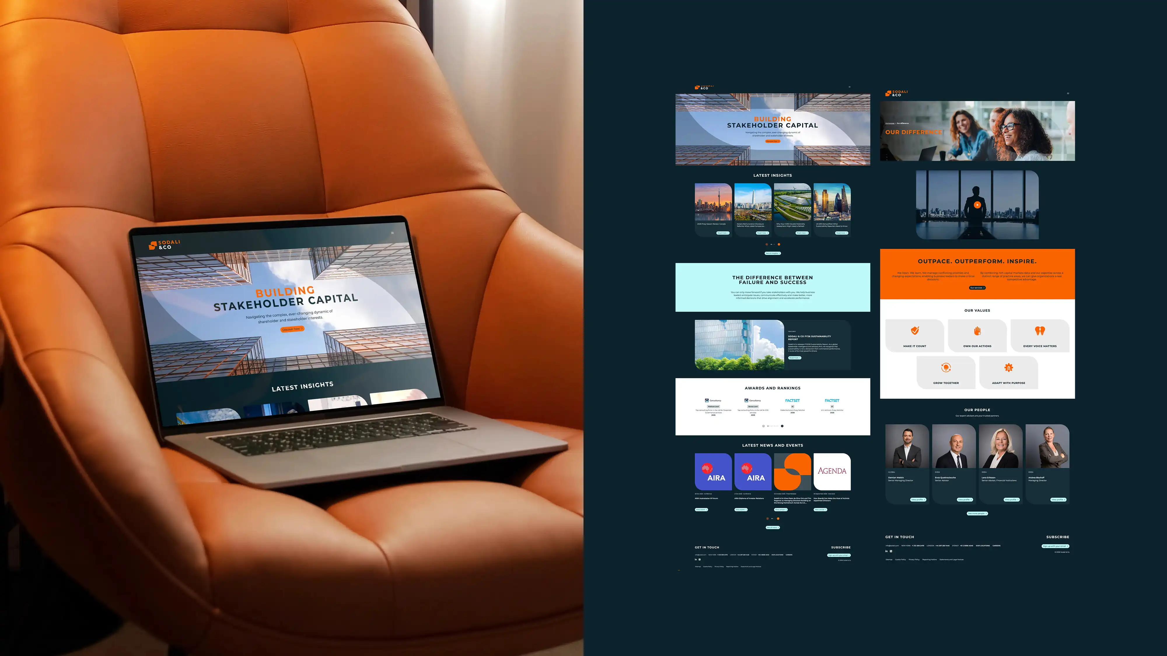
Website

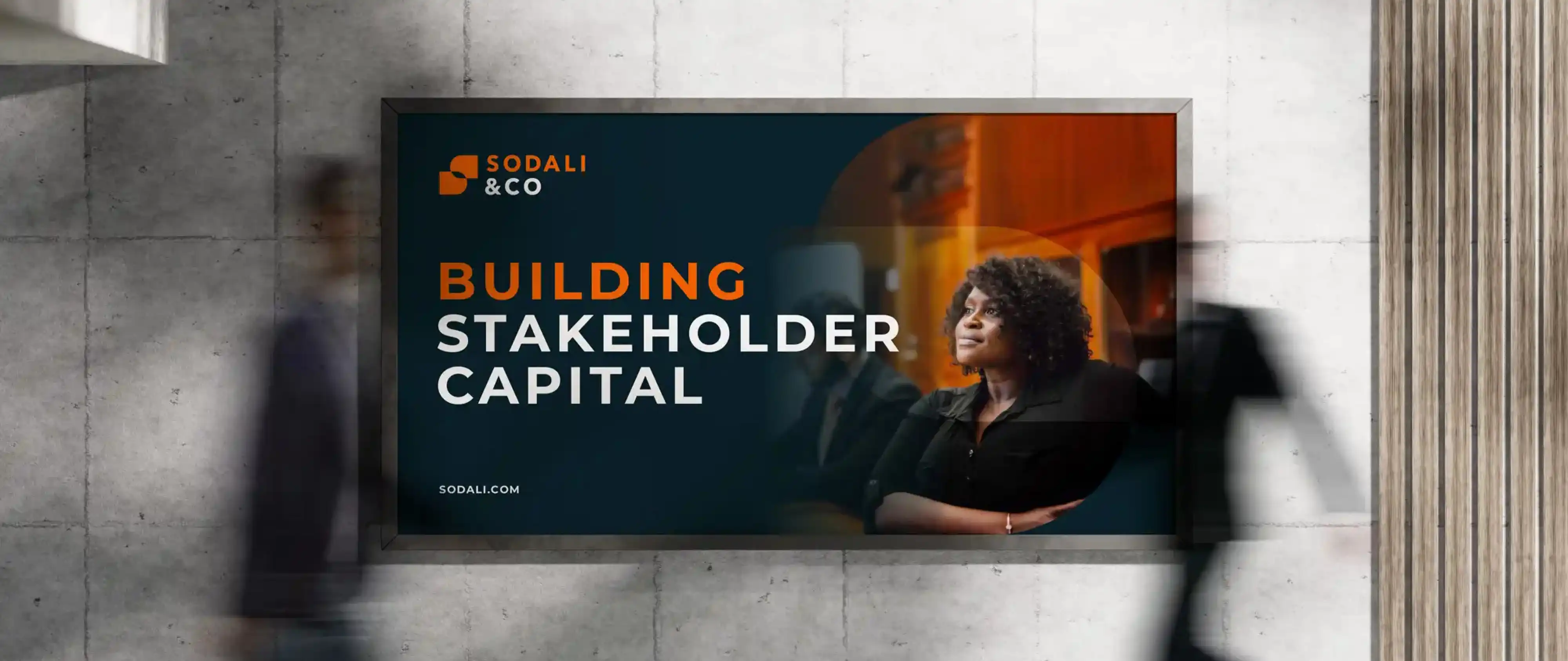
OOH

Sodali “S” variations

Logo transformation
I developed a visual system built around alignment, bringing competing stakeholder and shareholder interests together around a single point of focus.
This idea is expressed through a central negative-space device known as the “Iris”.
Logomark concept
Sodali & Co.
Brand Identity
Sodali & Co is a global stakeholder advisory firm formed following the rapid acquisition of twelve businesses.
The company needed to reposition itself as a modern consultancy capable of competing with established global players, uniting a group of companies under a single identity while communicating clarity, authority and trust within a conservative sector.
I led the development of the visual identity, from concept through to final guidelines, defining the Iris device and the wider design system, including typography, colour and layout principles, to support a global rollout.
Key art
© Robbie Palmer 2026

Brand guidelines
Sodali & Co launched successfully across 19 offices in 12 markets as a company united under one flag - with a distinctive visual identity, and a new brand architecture that organised their services into distinct practice areas, providing them with an operating model that enabled both acquisition and cross-sell.

Website

Pitch decks and brochures
Website

Website
OOH
A contemporary sans-serif positions the brand alongside global consultancies.
A restrained blue and white palette signals trust, with orange used for moments of emphasis and distinction.
The Iris acts as a flexible device across layouts, framing content and guiding composition.
Sodali “S” variations

Logo transformation
Logomark concept
I developed a visual system built around alignment, bringing competing stakeholder and shareholder interests together around a single point of focus.
This idea is expressed through a central negative-space device known as the “Iris”.

Key art
Sodali & Co.
Brand identity
Sodali & Co is a global stakeholder advisory firm formed following the rapid acquisition of twelve businesses.
The company needed to reposition itself as a modern consultancy capable of competing with established global players, uniting a group of companies under a single identity while communicating clarity, authority and trust within a conservative sector.
I led the development of the visual identity, from concept through to final guidelines, defining the Iris device and the wider design system, including typography, colour and layout principles, to support a global rollout.
