© Robbie Palmer 2026
Hupe
Brand Identity
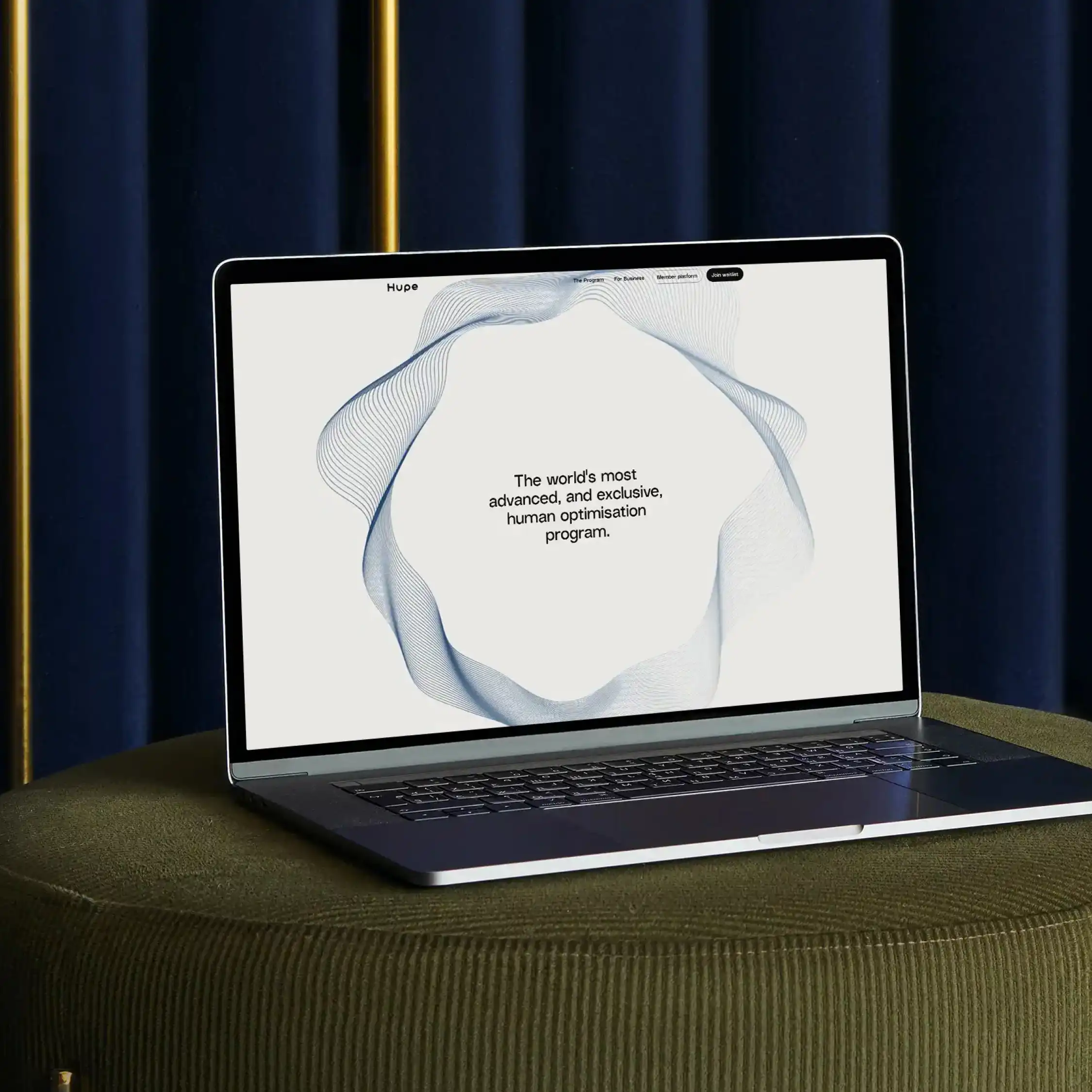
Hupe is a personalised health platform combining diagnostics, data and human expertise to deliver tailored wellness plans.
The challenge was to translate a complex, data-driven proposition into a visual identity that felt human. The system needed to express individuality while maintaining consistency.
Working from the selected creative direction, I developed the design system and its application rules, defining how key visual assets behave across touchpoints.

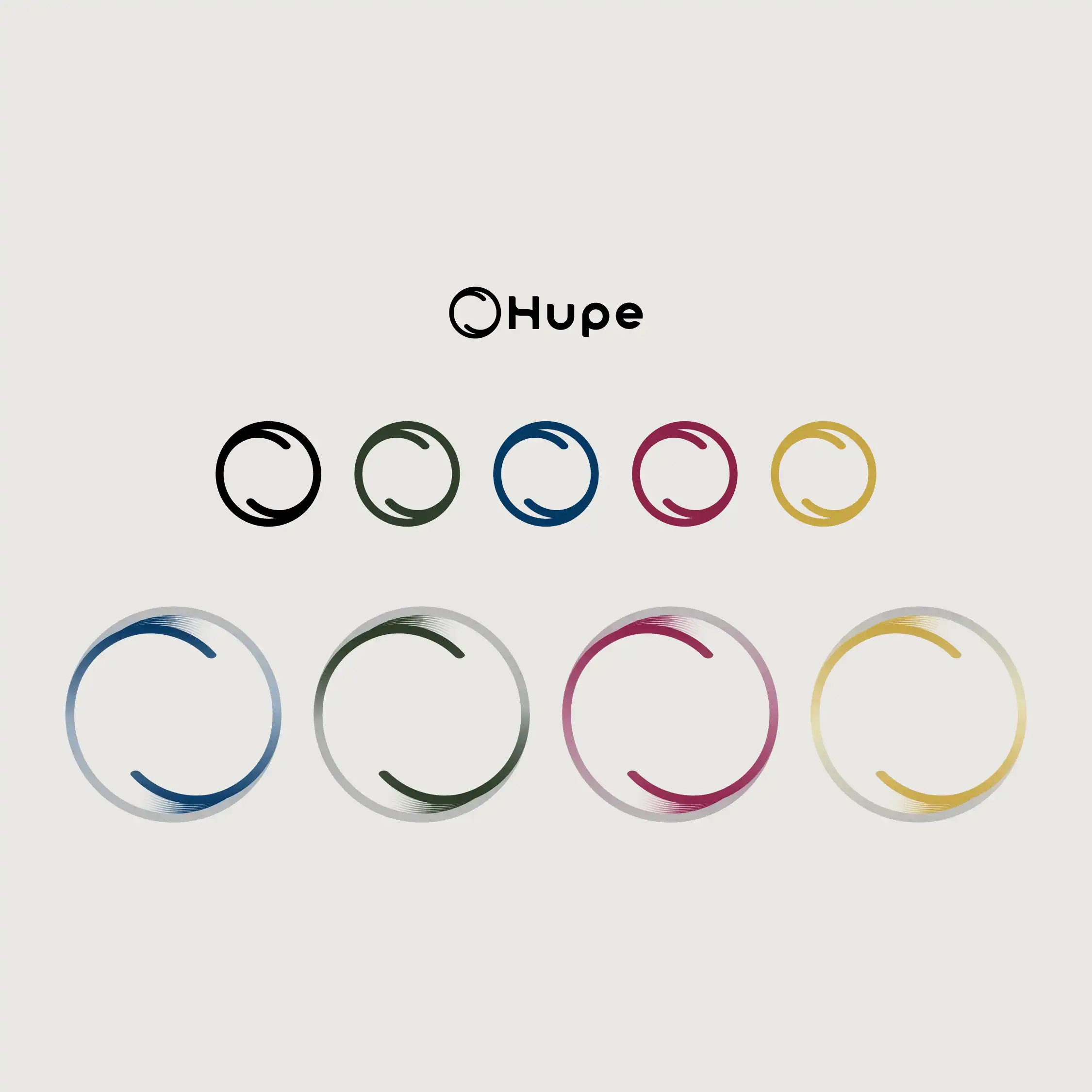
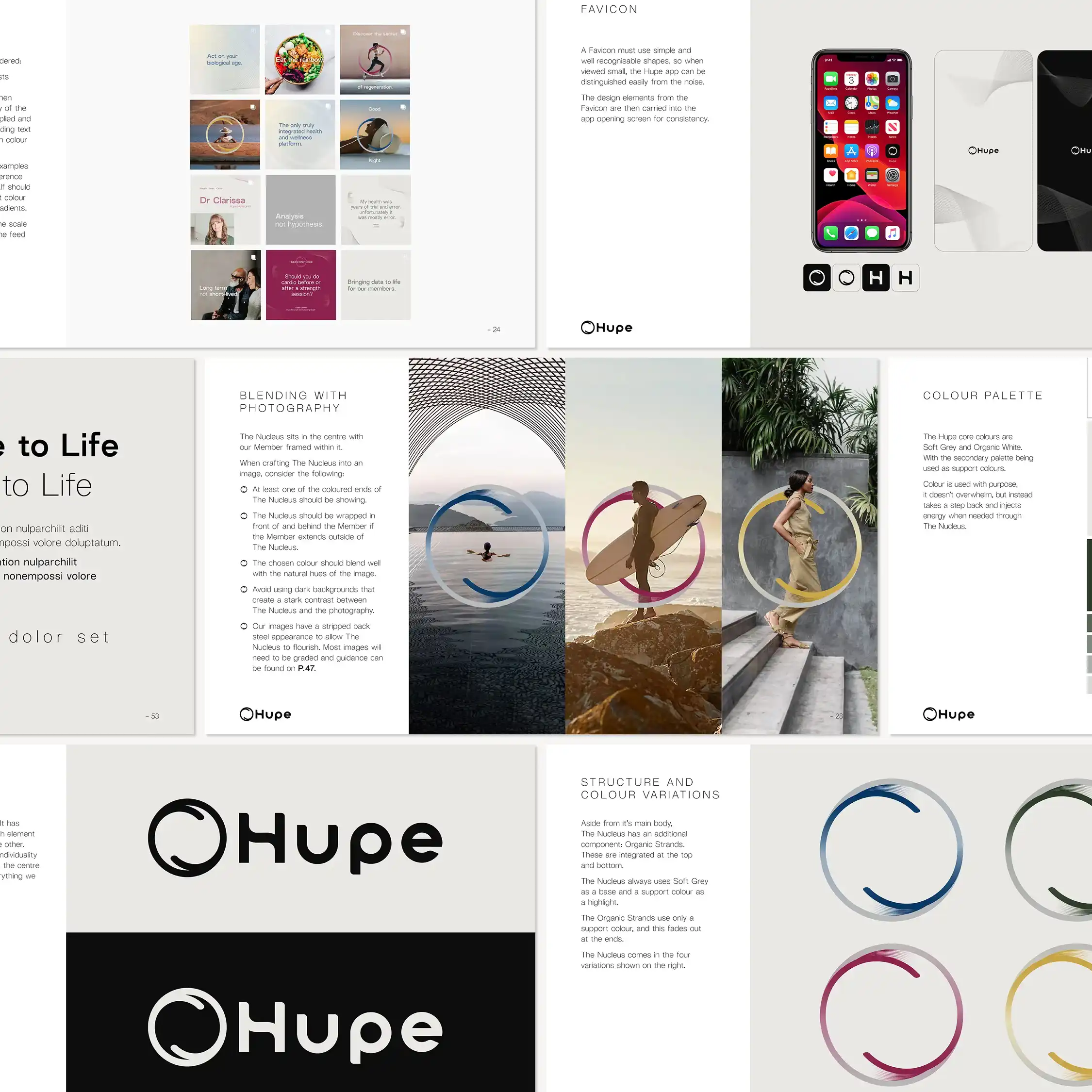
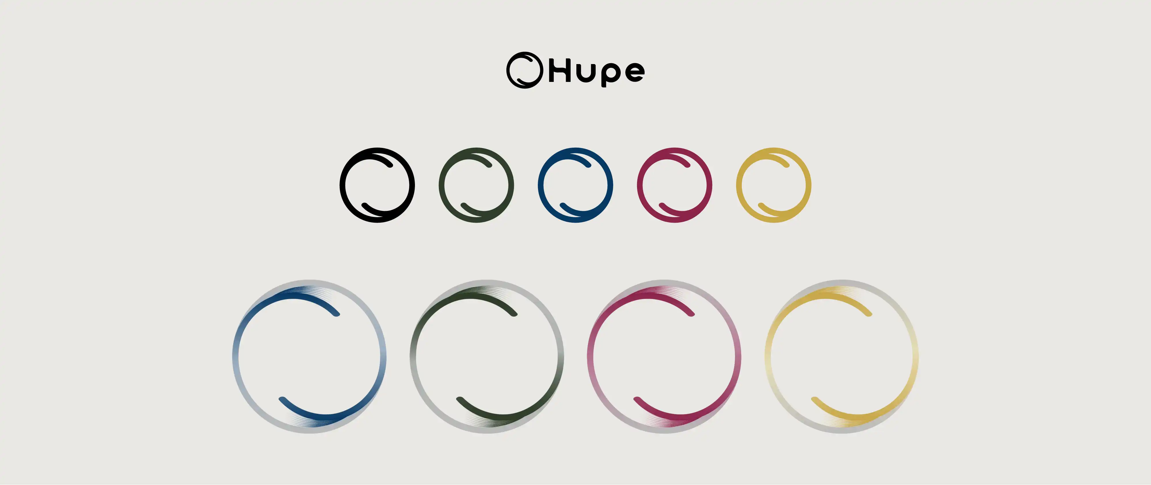
The Nucleus forms both the brand mark and a core graphic device, framing the individual at the centre of the service.
This is supported by a palette inspired by primary colours, reflecting the variation in raw data that underpins a tailored approach.
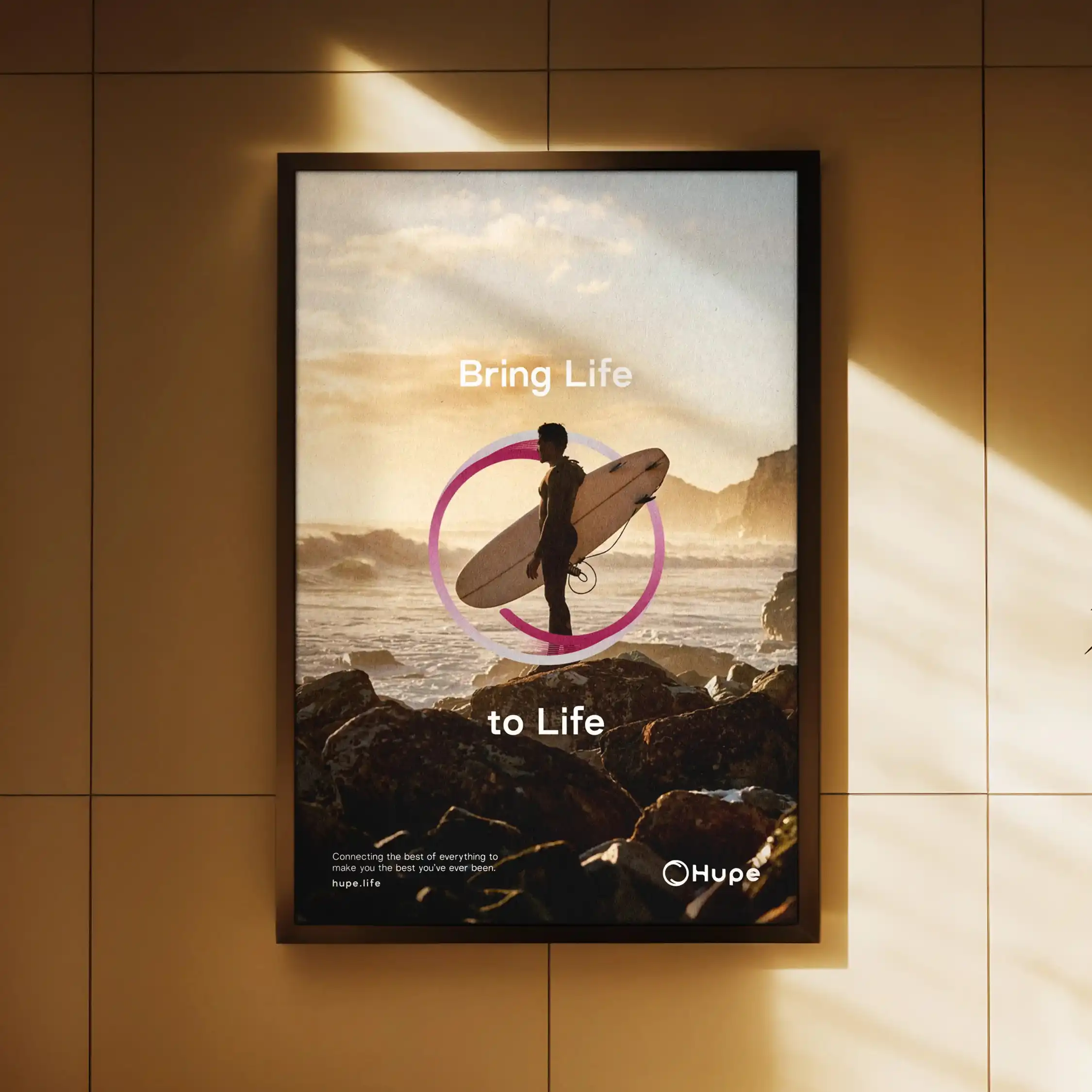
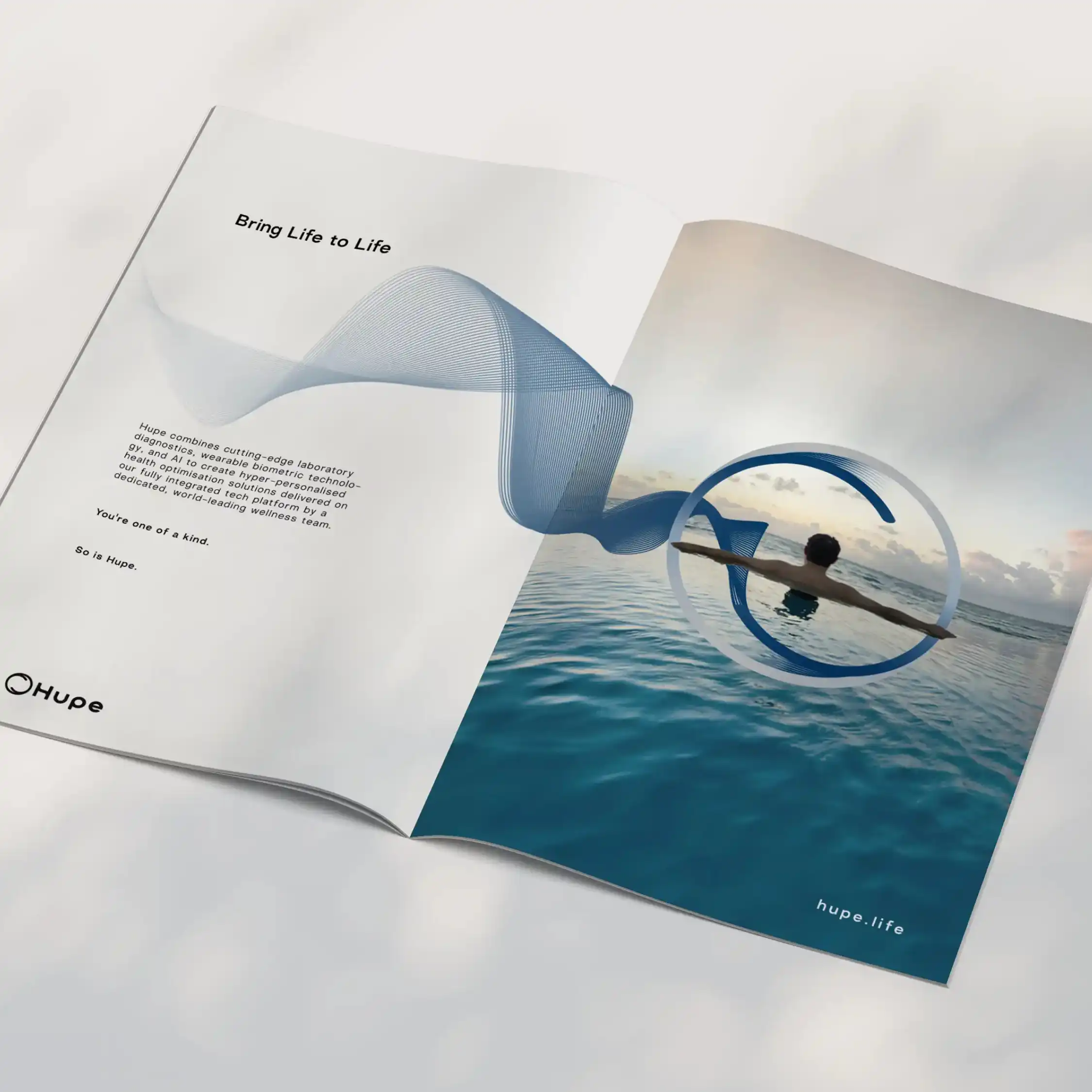
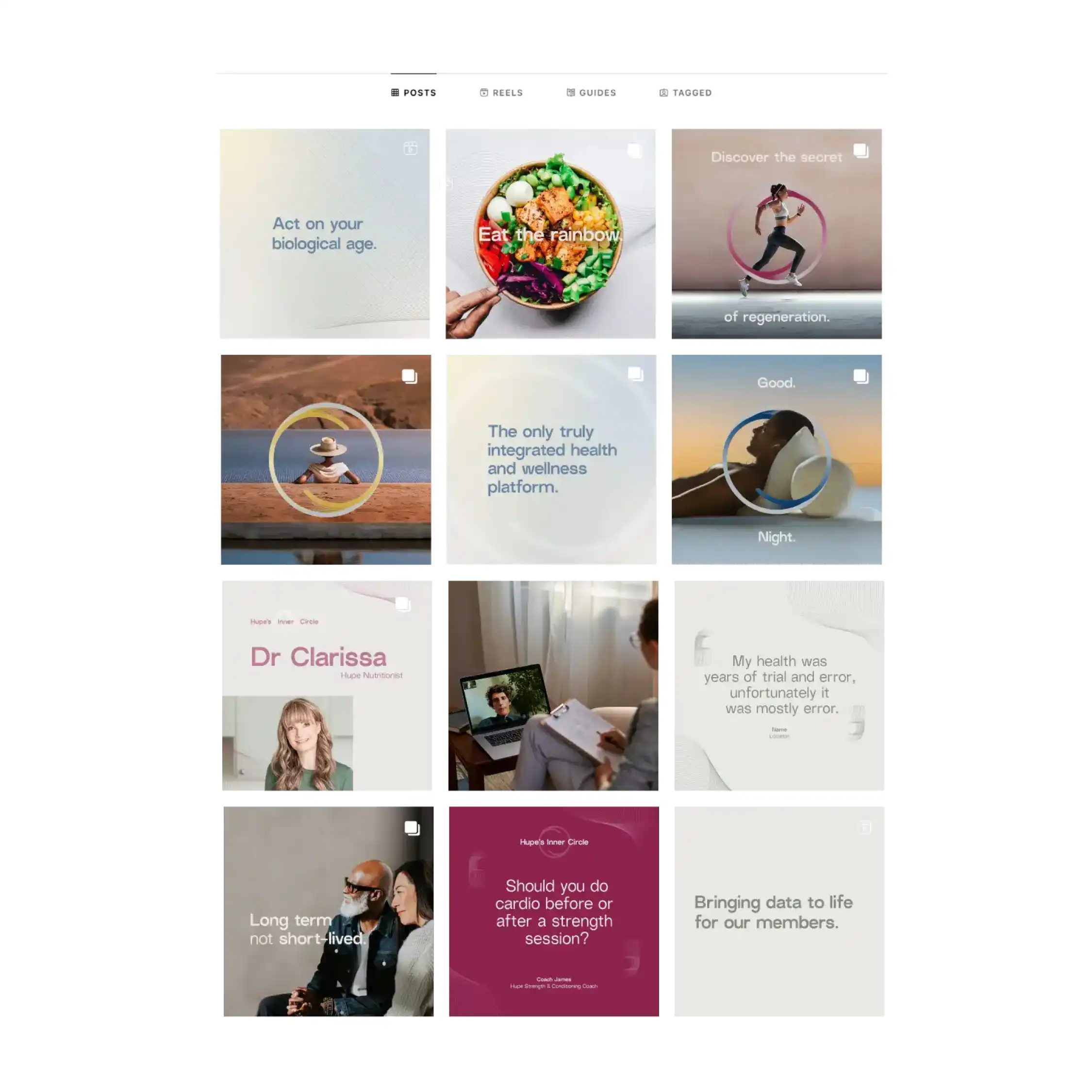
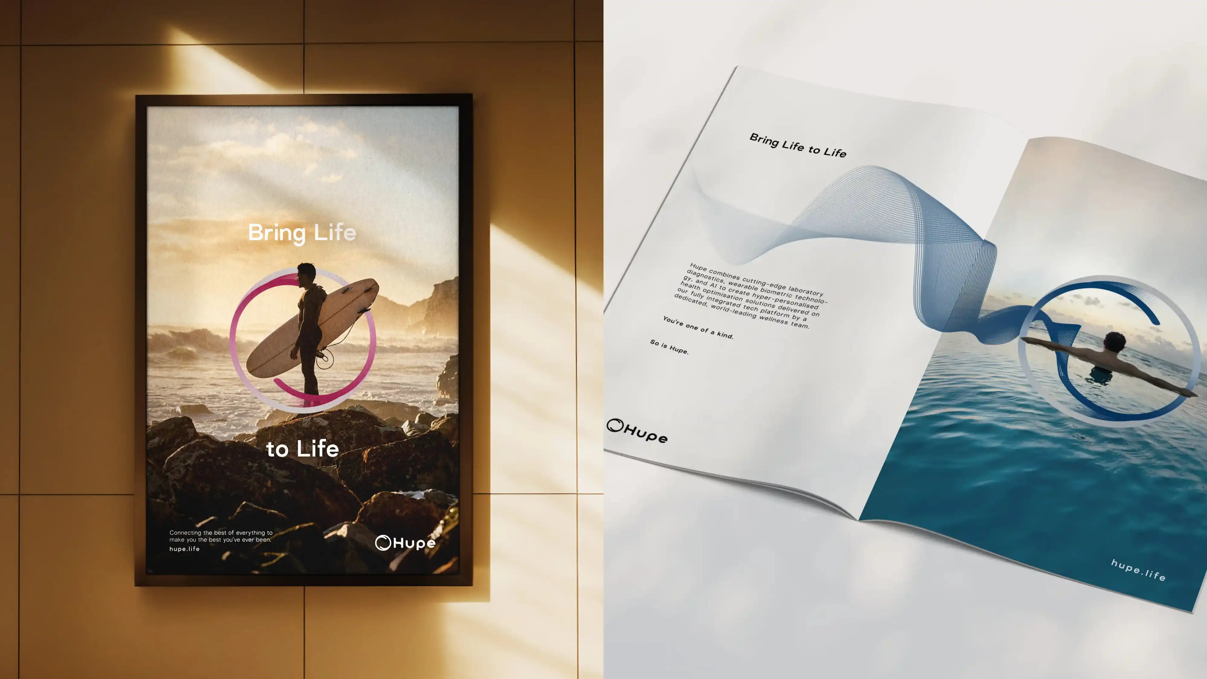
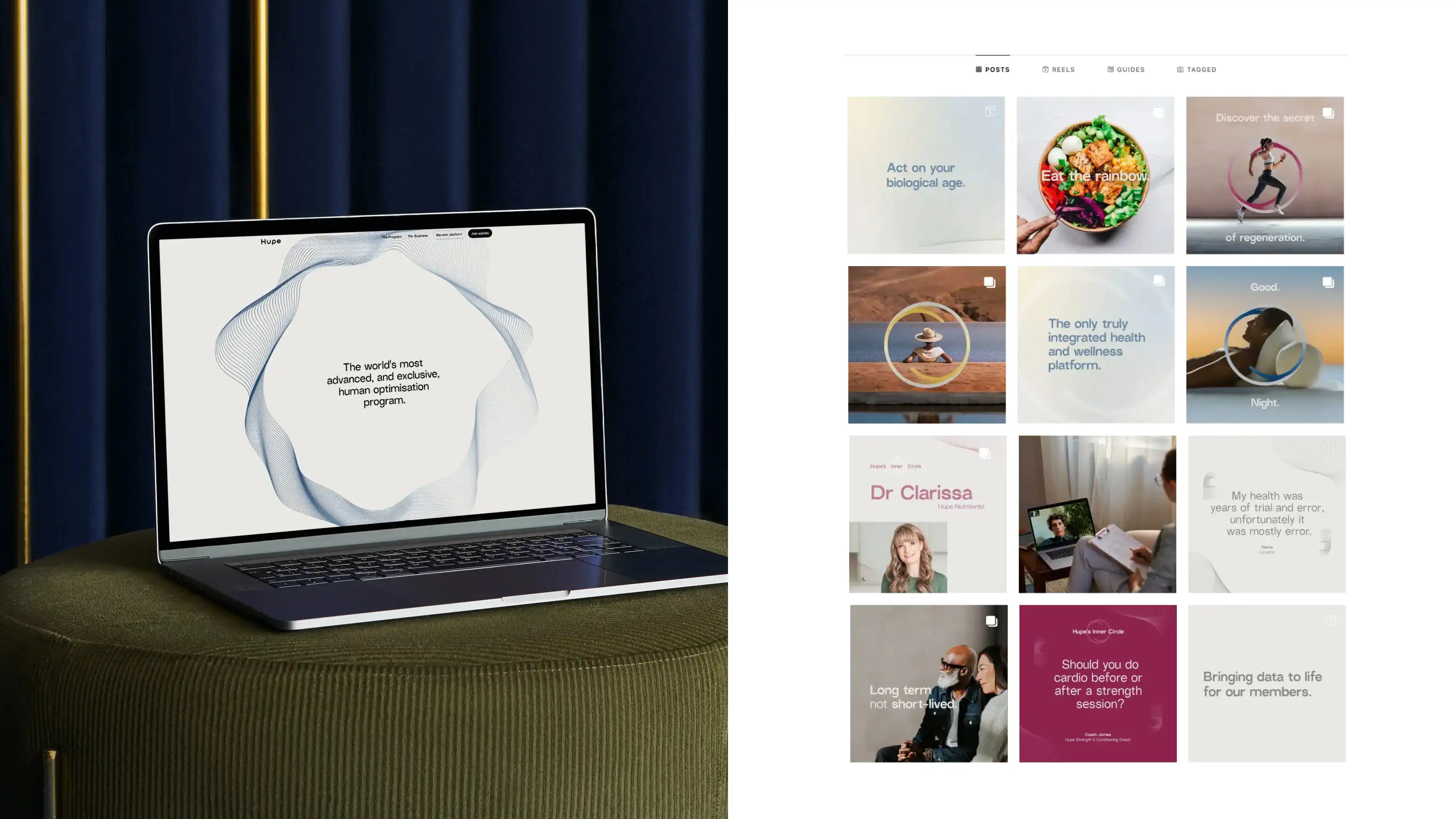
The photography approach captures moments of connection and individuality, placing members at the centre of the identity and reinforcing the human focus of the service.
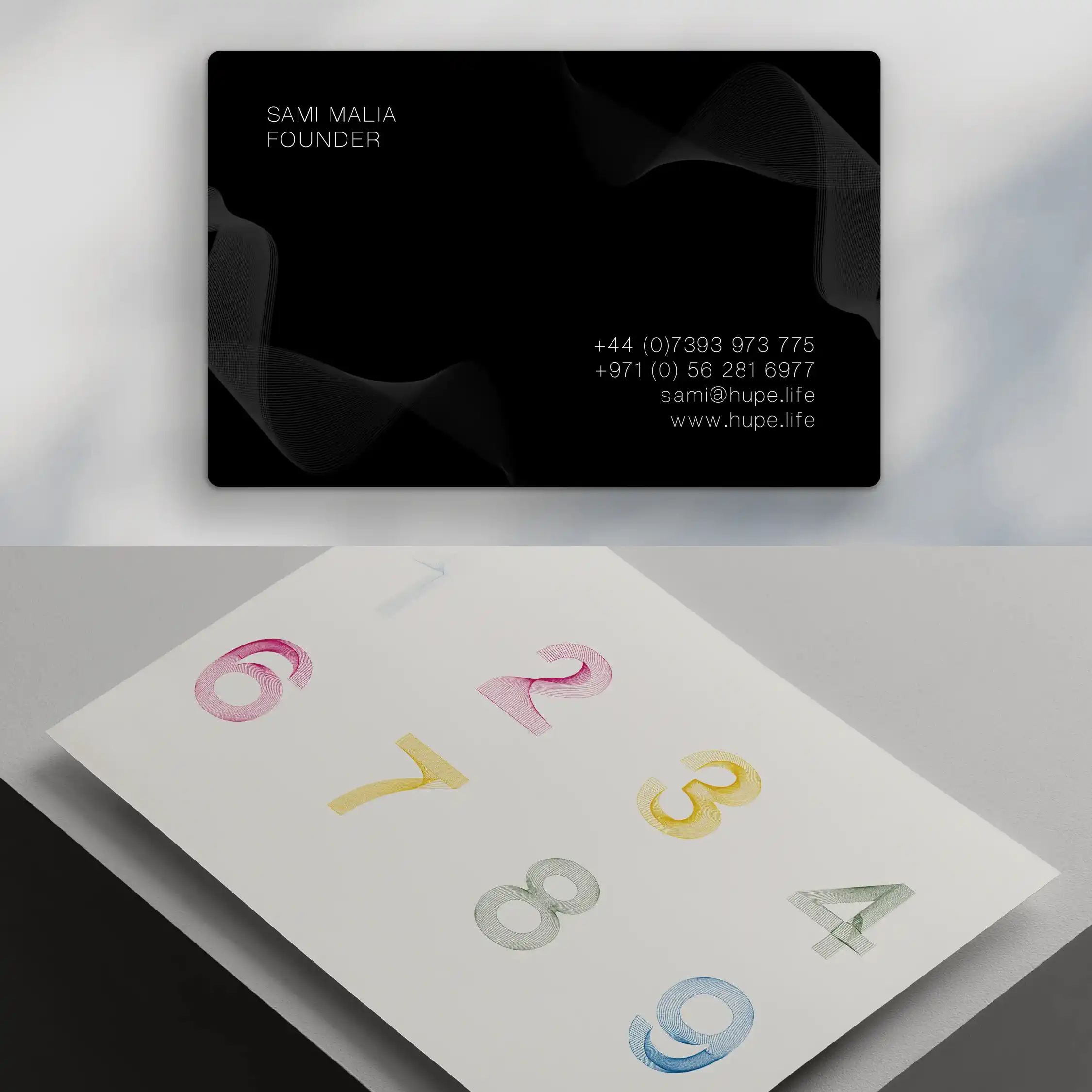
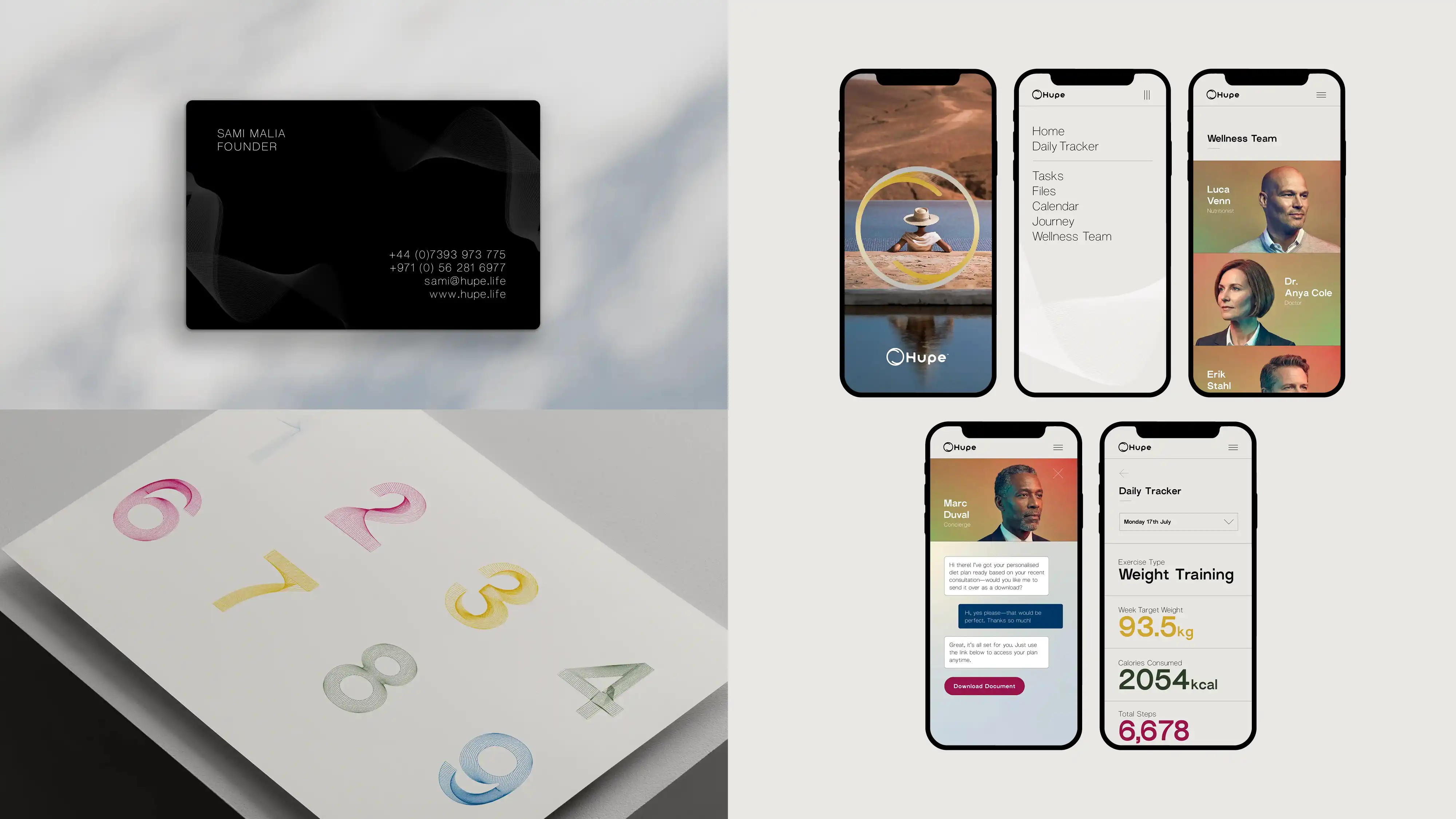
A customised grotesk typeface with ink trap features balances technical precision with a sense of care and approachability.

MultidisciplinarySenior Designer
© Robbie Palmer 2026

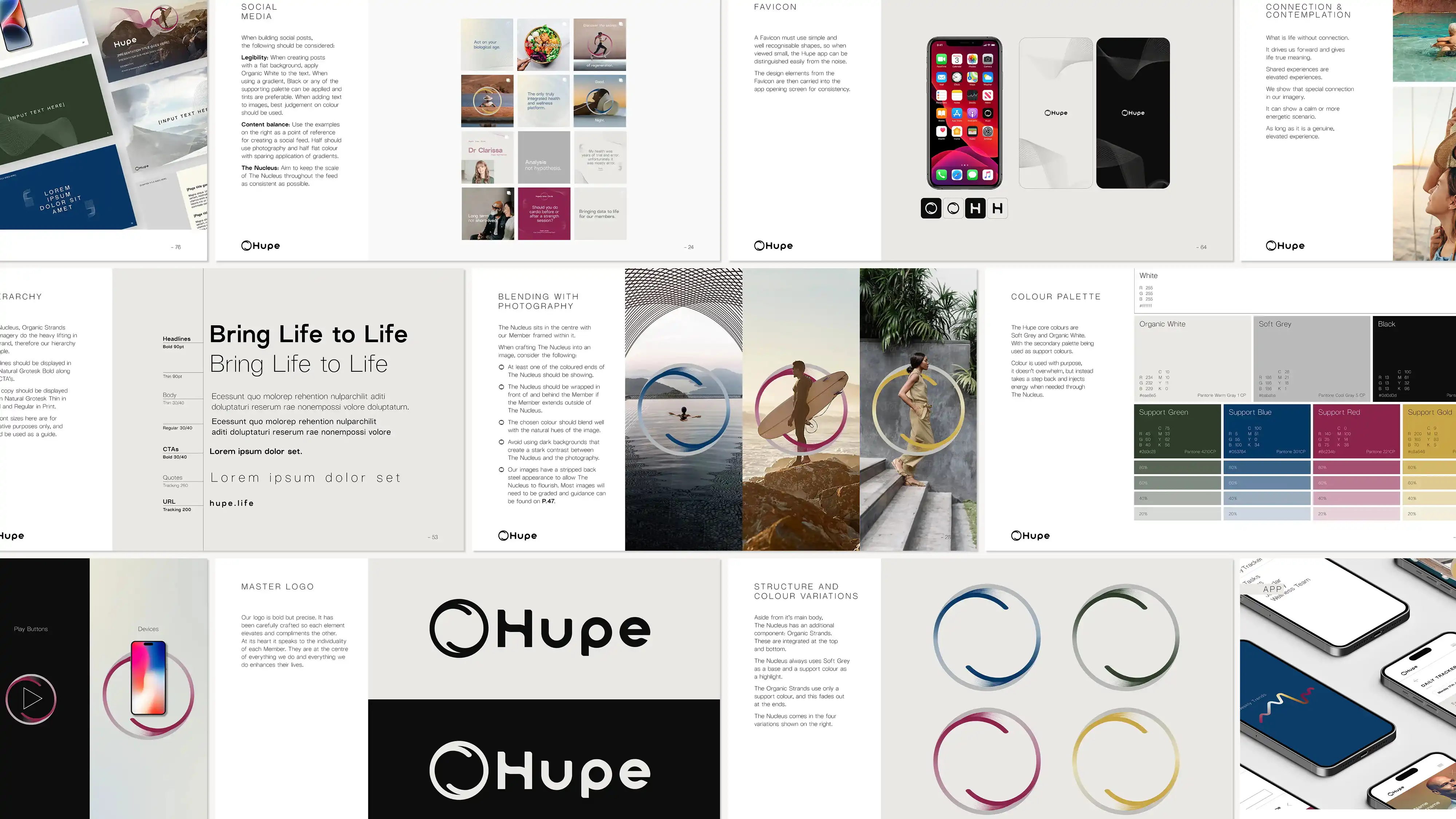

Brand guidelines
Website

Business card, creative type and app concept

Adcepts

The nucleus, favicons and logomark
The Nucleus forms both the brand mark and a core graphic device, framing the individual at the centre of the service.
This is supported by a palette inspired by primary colours, reflecting the variation in raw data that underpins a tailored approach.

The nucleus
Hupe
Brand Identity
Hupe is a personalised health platform combining diagnostics, data and human expertise to deliver tailored wellness plans.
The challenge was to translate a complex, data-driven proposition into a visual identity that felt human. The system needed to express individuality while maintaining consistency.
Working from the selected creative direction, I developed the design system and its application rules, defining how key visual assets behave across touchpoints.
© Robbie Palmer 2026

Brand guidelines
Website and social feed
Business card, creative type and app concept
Adcepts
The photography approach captures moments of connection and individuality, placing members at the centre of the identity and reinforcing the human focus of the service.
A customised grotesk typeface with ink trap features balances technical precision with a sense of care and approachability.

The nucleus, favicons and logomark
The Nucleus forms both the brand mark and a core graphic device, framing the individual at the centre of the service.
This is supported by a palette inspired by primary colours, reflecting the variation in raw data that underpins a tailored approach.

The nucleus
Hupe
Brand Identity
Hupe is a personalised health platform combining diagnostics, data and human expertise to deliver tailored wellness plans.
The challenge was to translate a complex, data-driven proposition into a visual identity that felt human. The system needed to express individuality while maintaining consistency.
Working from the selected creative direction, I developed the design system and its application rules, defining how key visual assets behave across touchpoints.
