© Robbie Palmer 2026
BW Workplace Experts
Brand Refresh
BW are workplace specialists founded in 2000, providing office builds, fit-outs and campus refurbishments, crafting modern spaces for a changing world of work and education.
As a company, they have always prided themselves on putting the people who do the work front and centre of their brand, with a good dose of humour and playfulness to boot.
BW wanted to incorporate more of these qualities into the fundamentals of their design system, so we were tasked with developing a refresh that preserved the heritage of their logo, core typeface and distinctive brand blue, while putting everything else up for grabs.
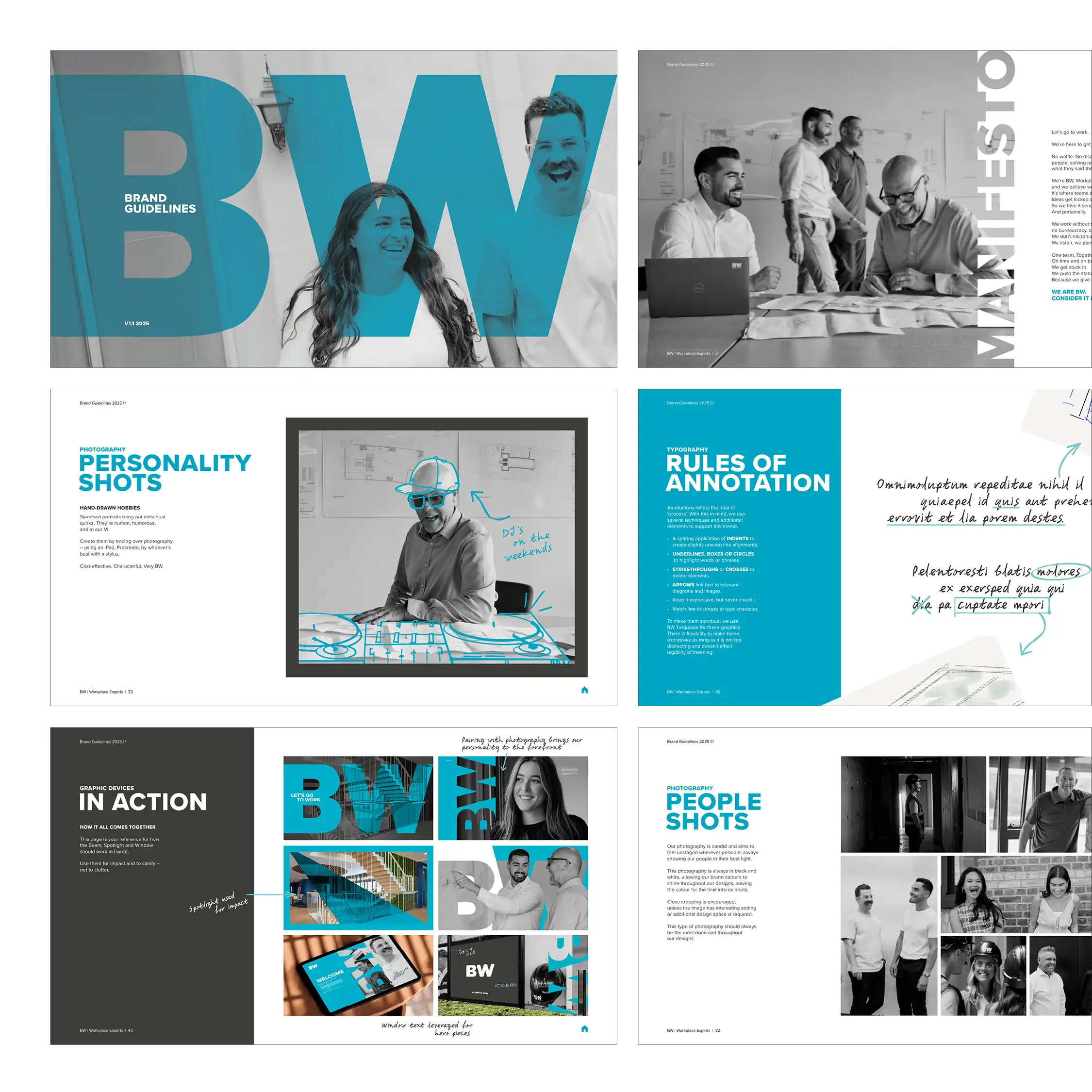
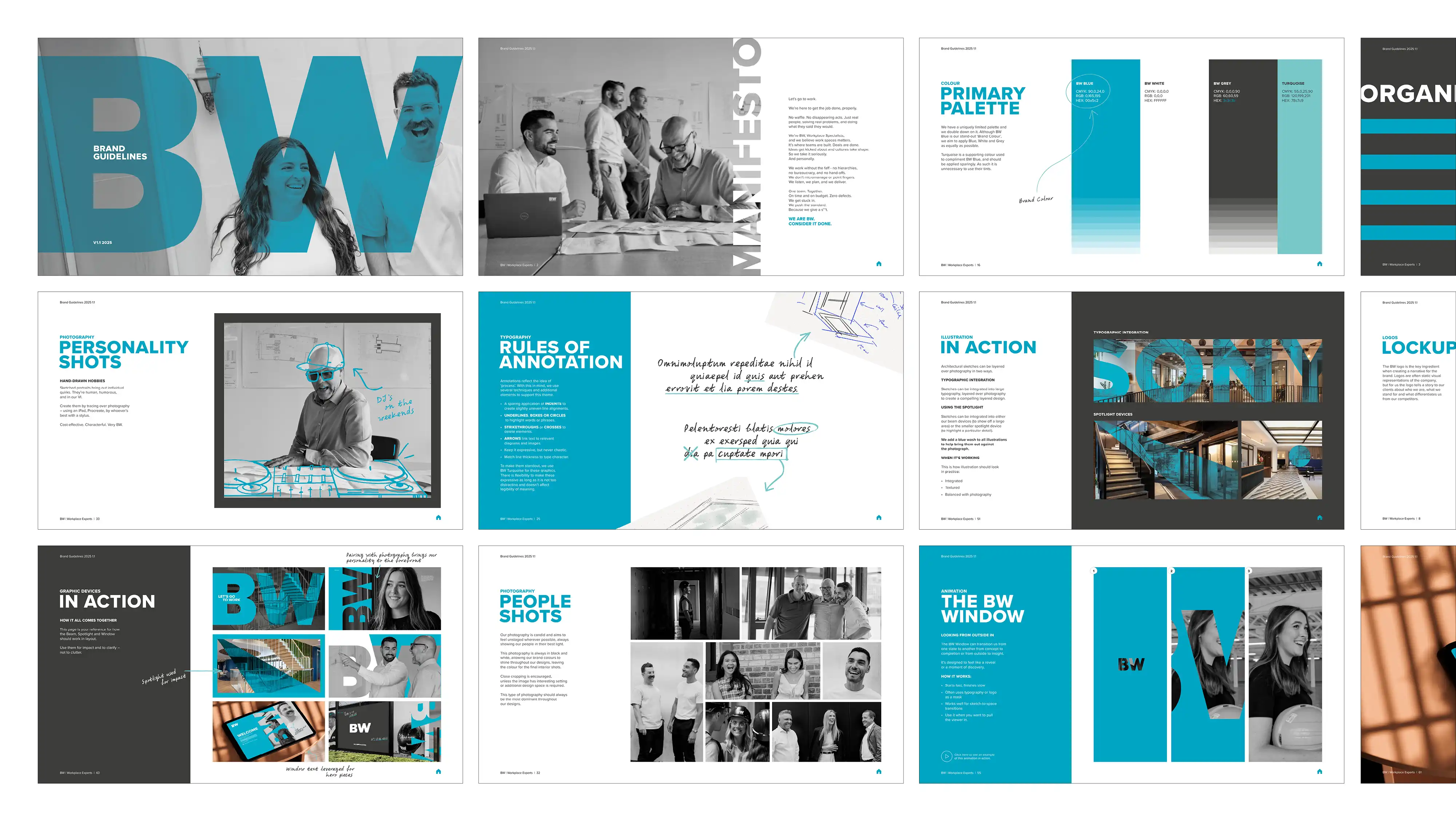
I refined the initial art direction, defined the design system and application rules, and developed the final set of brand guidelines.
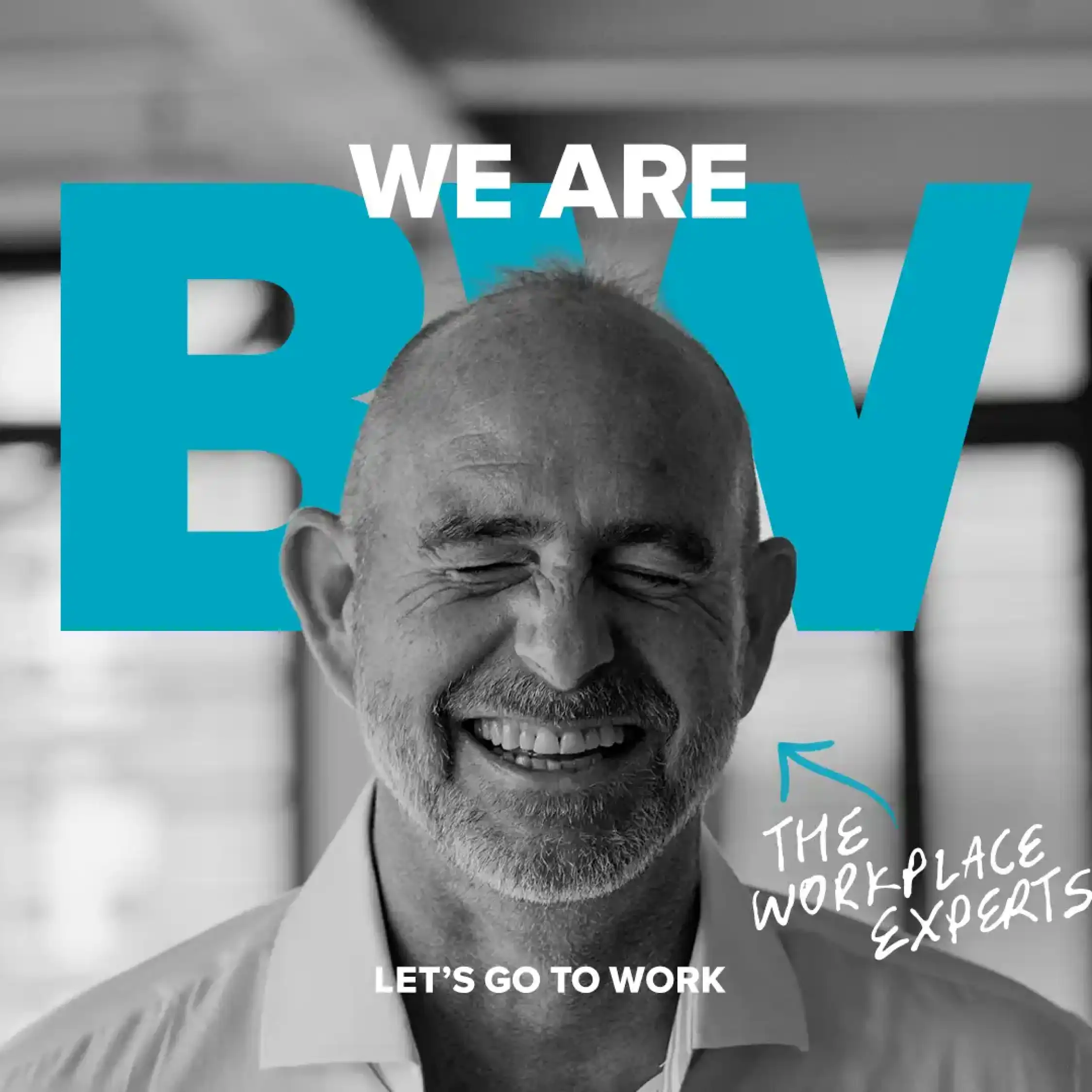
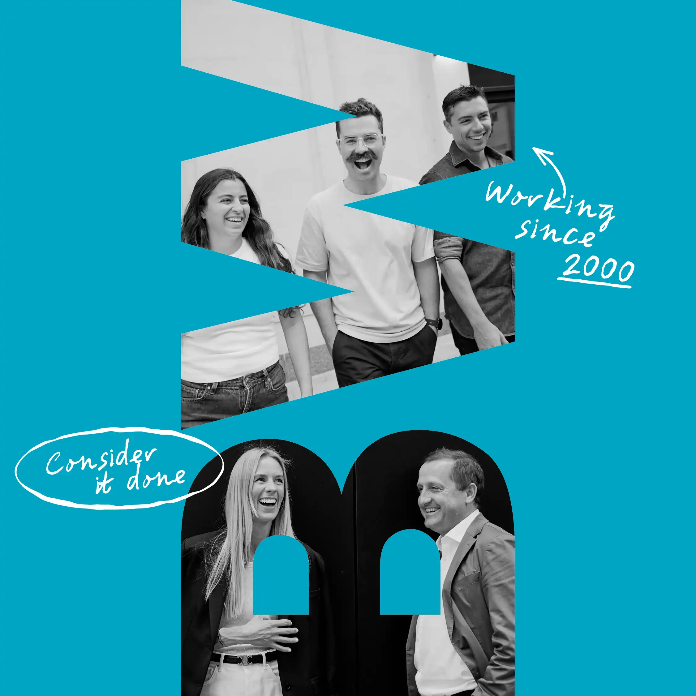
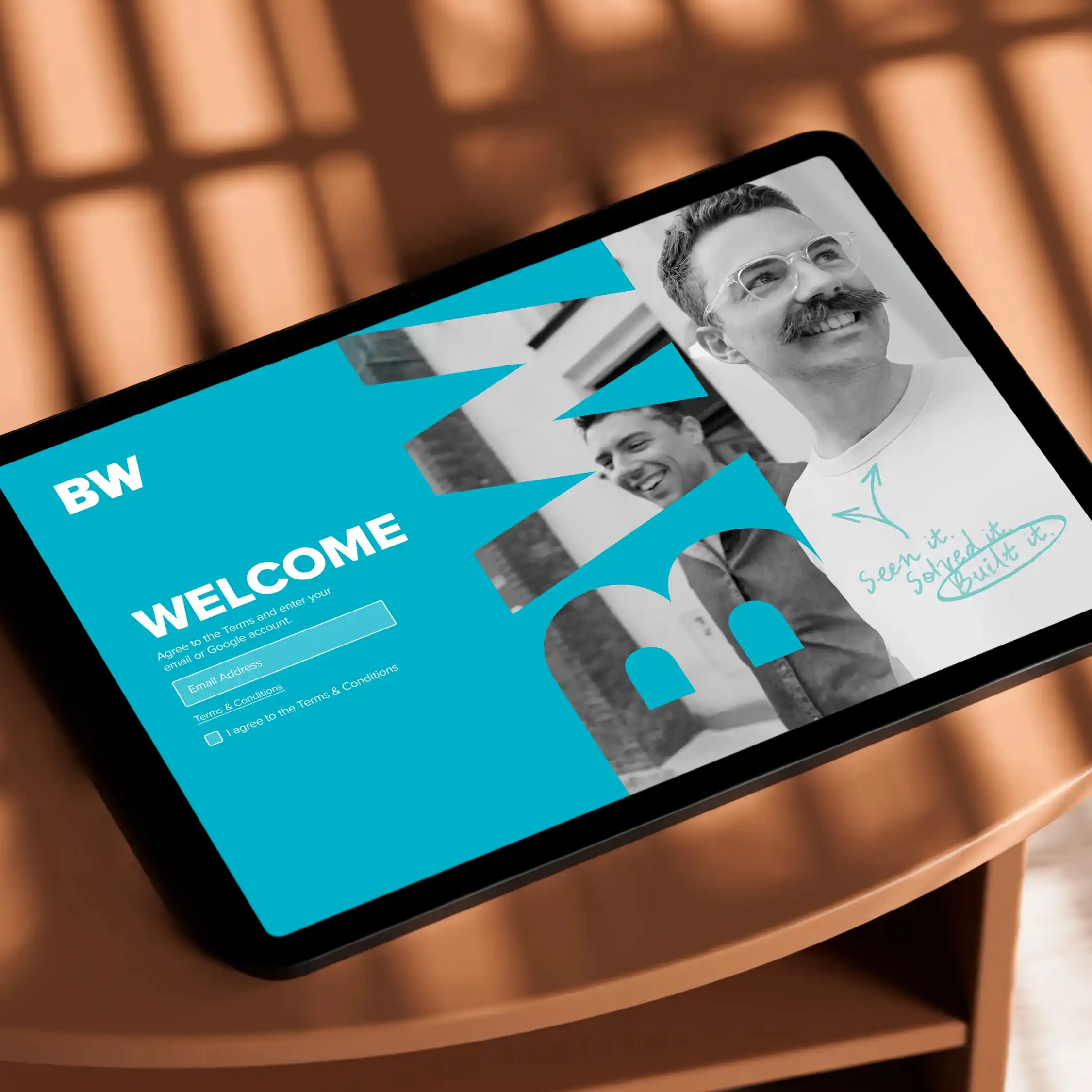
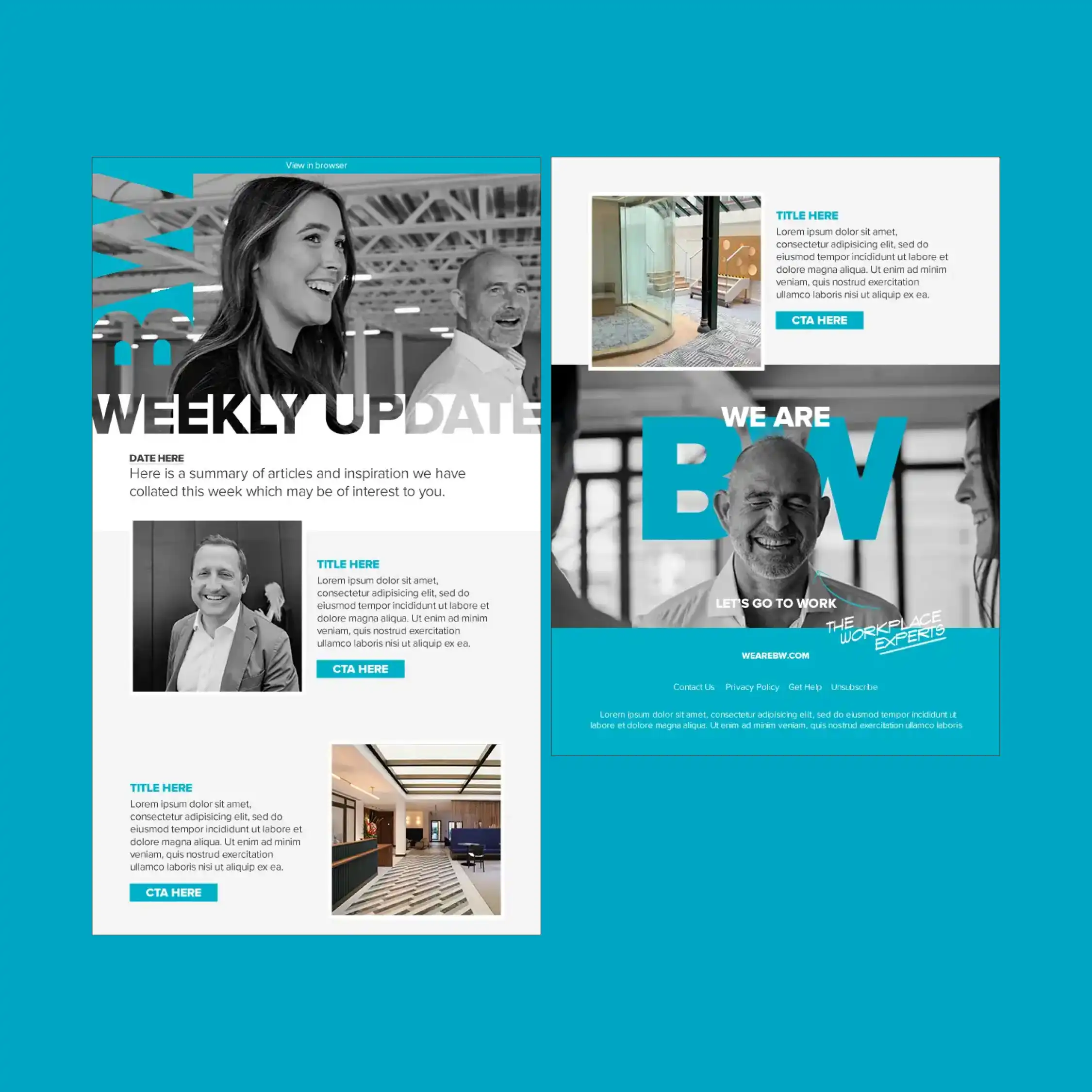
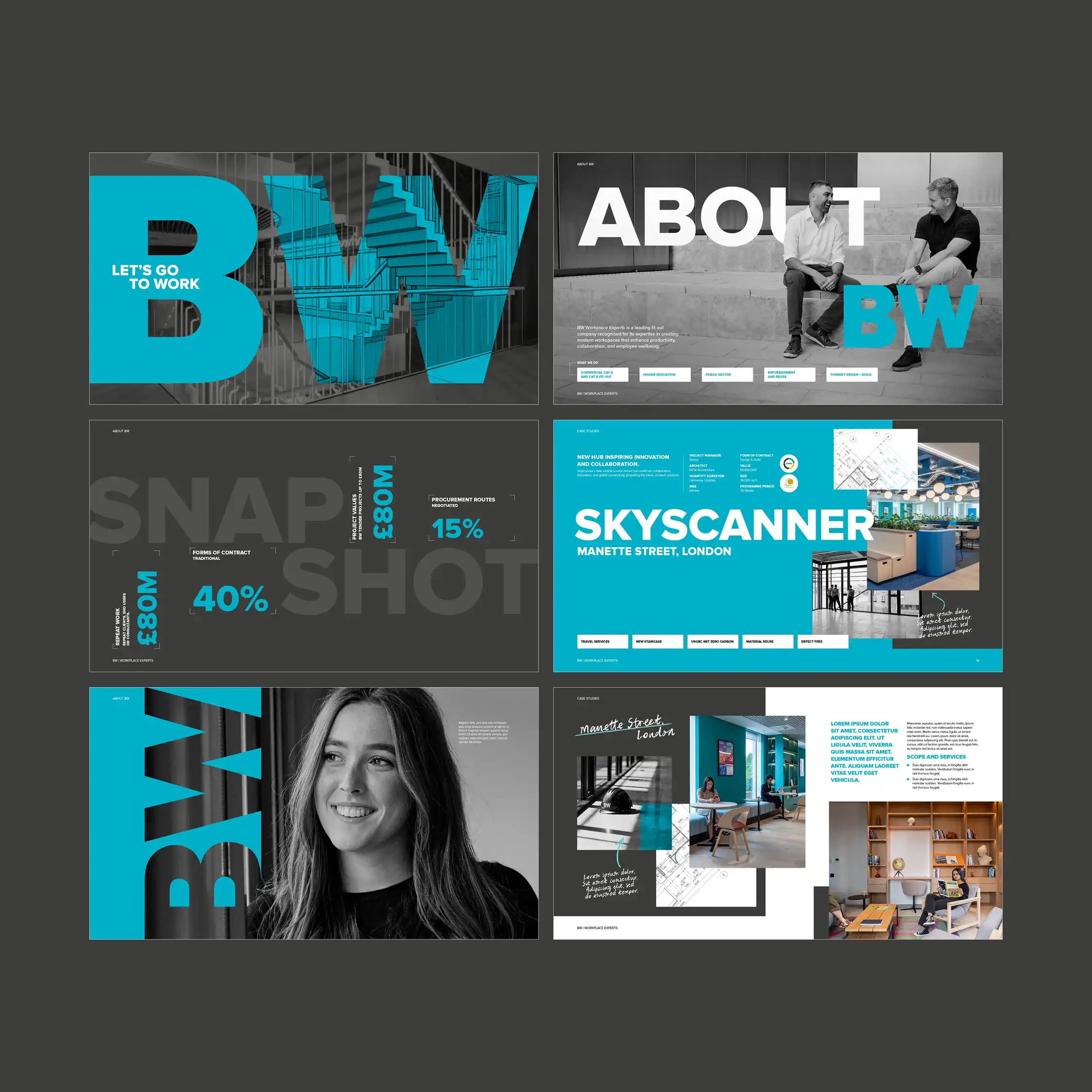
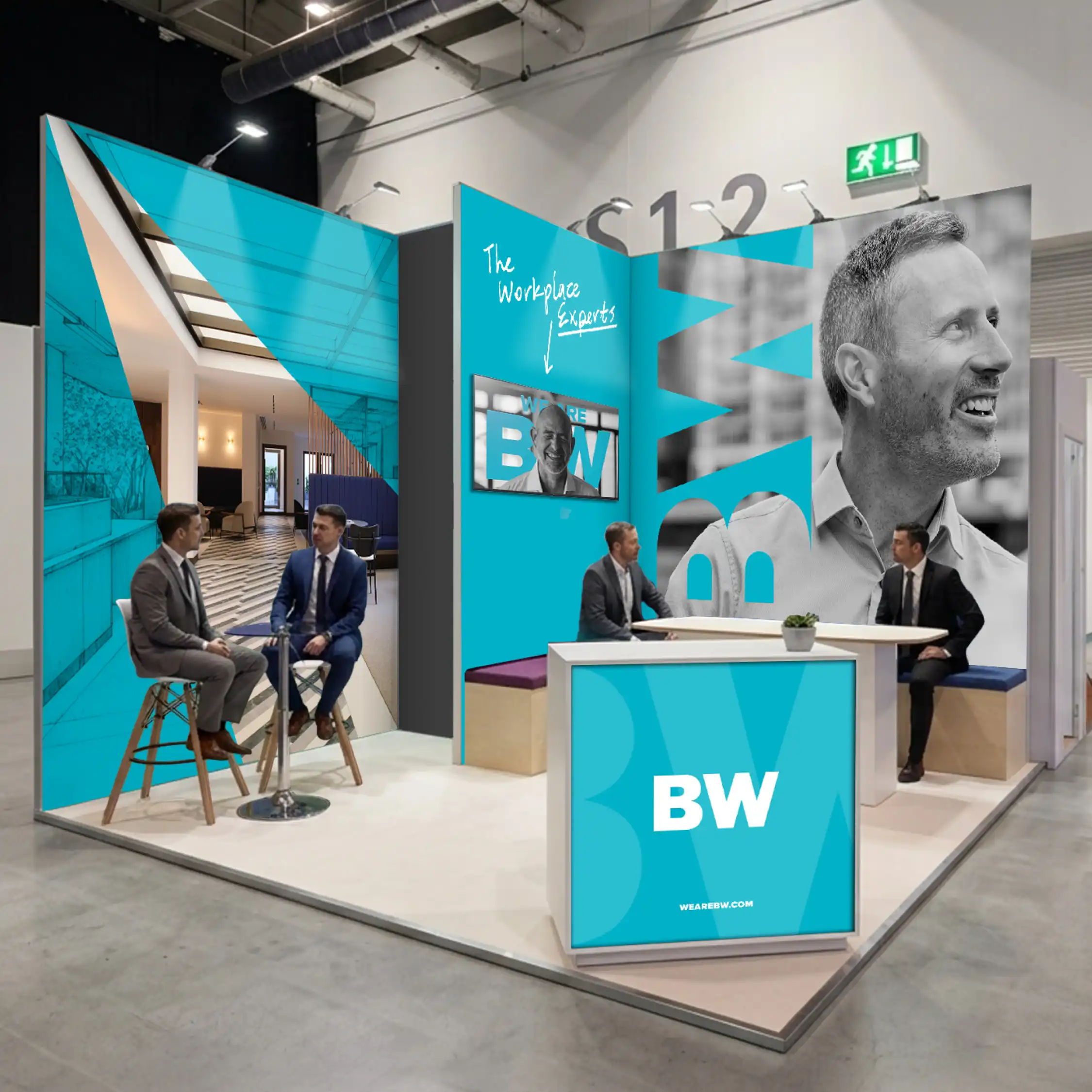
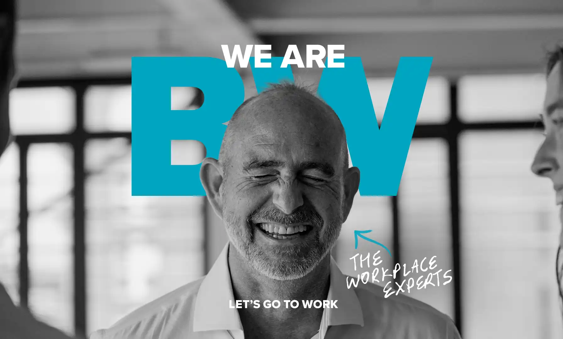
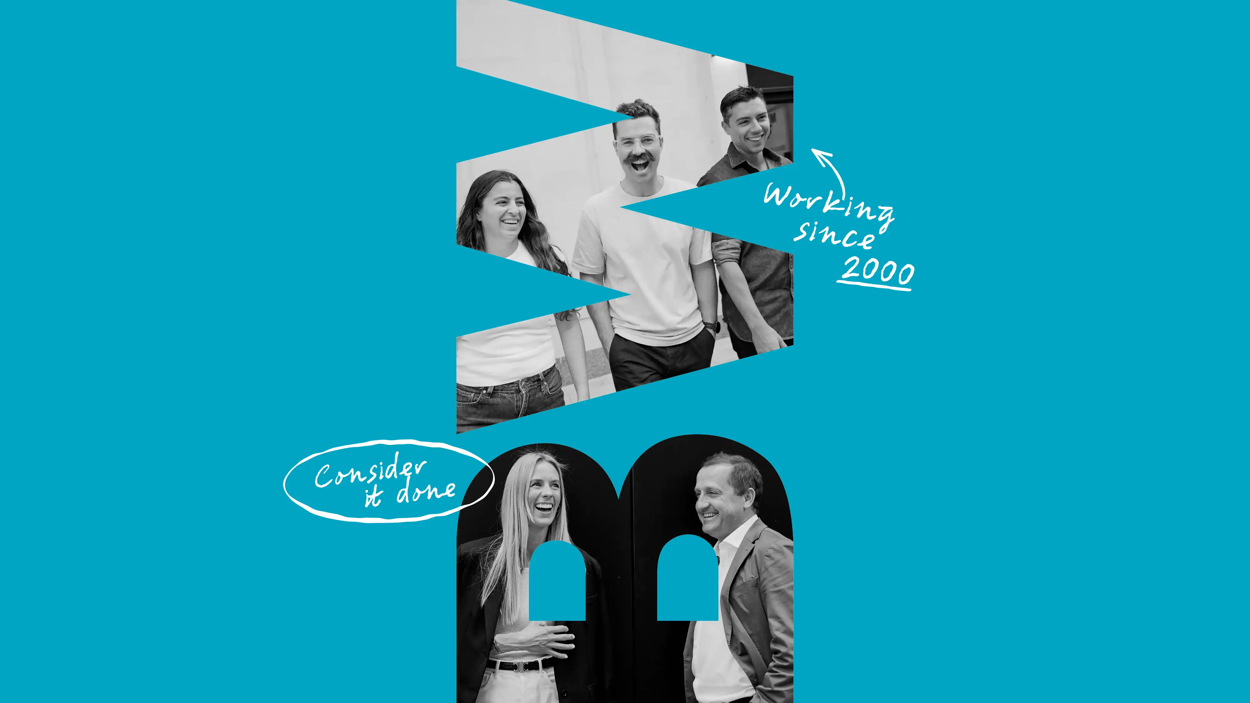
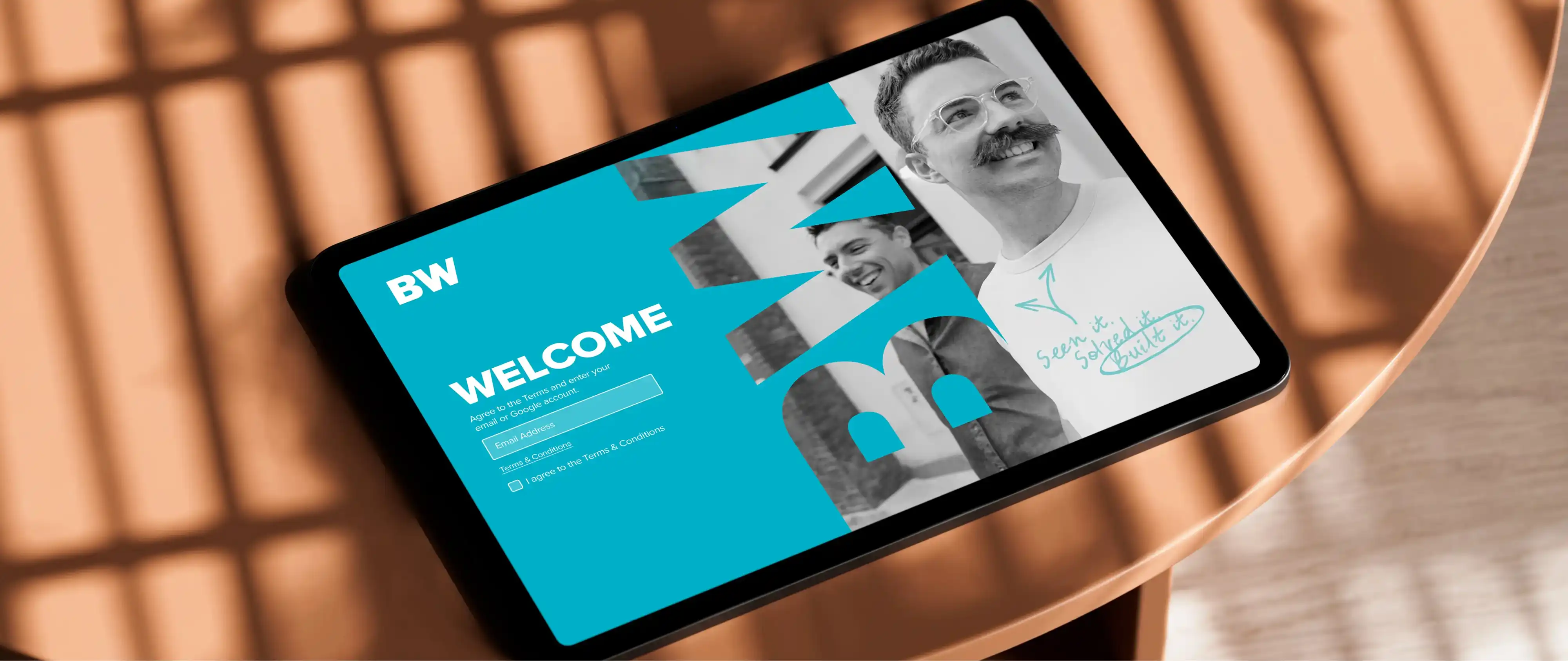
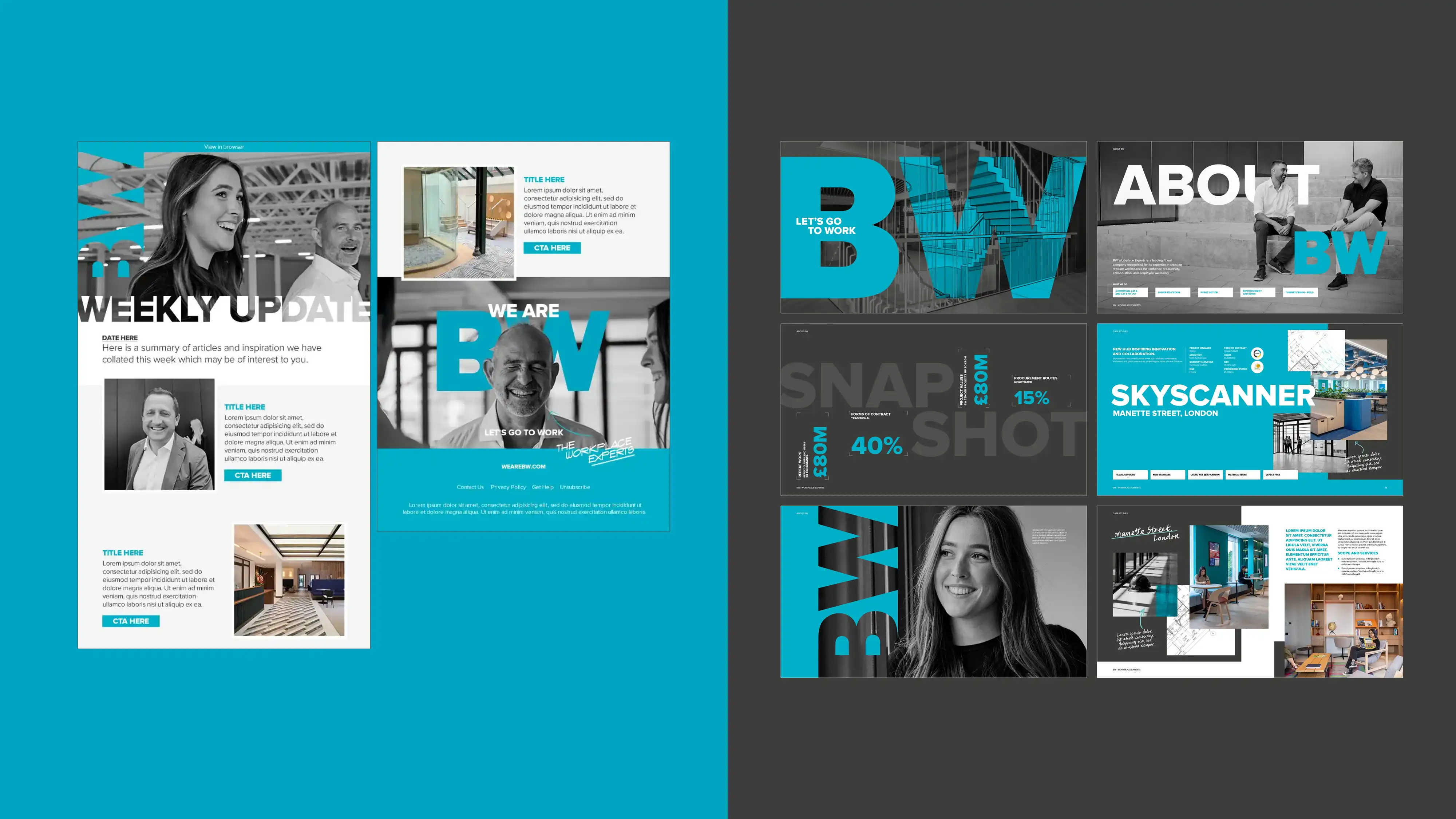
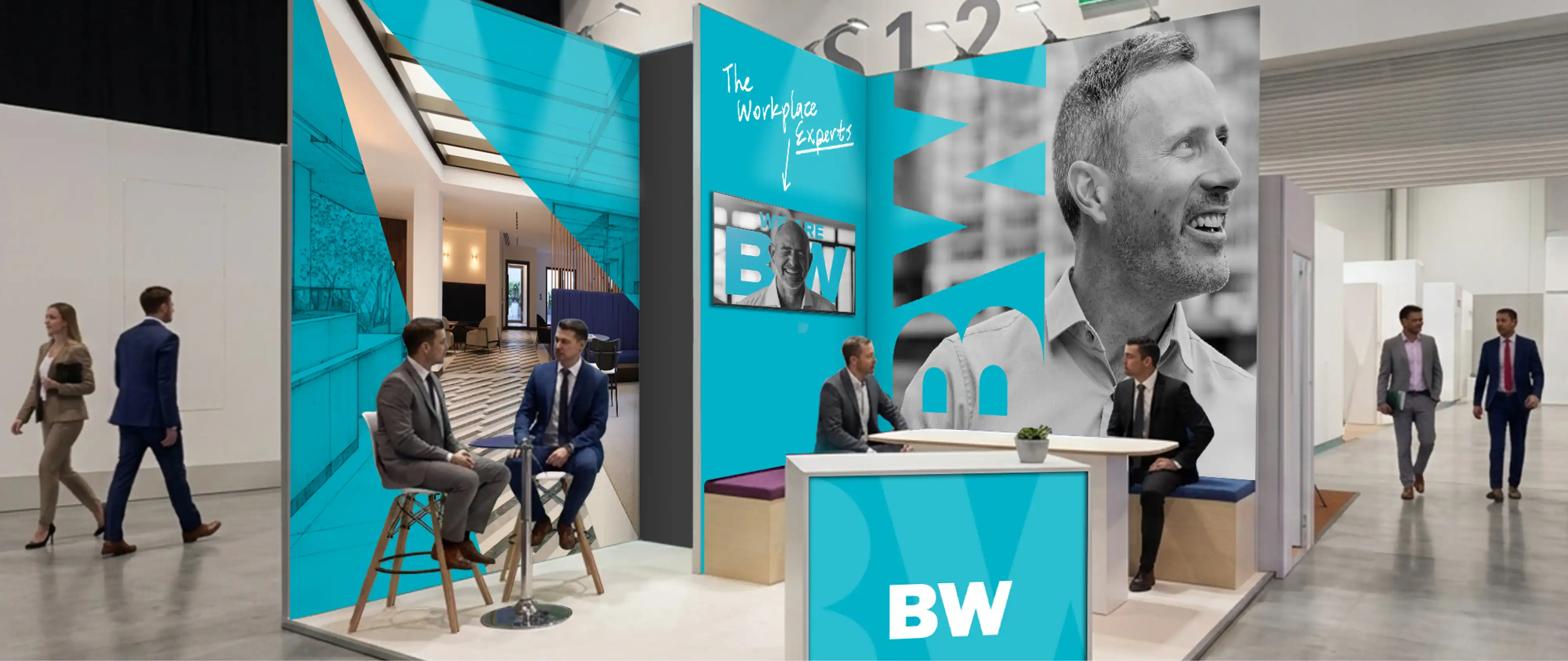
We decided to introduce elements and applications that visually nod to architecture, starting with layered photography and graphics, and making large, bold typography a foundational element of the page structure and design.
Finally, we added those playful flourishes: an earnest, handwritten secondary typeface resembling architectural notations, and a brand-new set of portraits of the BW staff that bring out the personality of the company and its people.

MultidisciplinarySenior Designer
© Robbie Palmer 2026

Event space

EDM and pitch decks

Landing page

VI elements
We decided to introduce elements and applications that visually nod to architecture, starting with layered photography and graphics, and making large, bold typography a foundational element of the page structure and design.
Finally, we added those playful flourishes: an earnest, handwritten secondary typeface resembling architectural notations, and a brand-new set of portraits of the BW staff that bring out the personality of the company and its people.

Key art
BW Workplace Experts
Brand Refresh
BW are workplace specialists founded in 2000, providing office builds, fit-outs and campus refurbishments, crafting modern spaces for a changing world of work and education.
As a company, they have always prided themselves on putting the people who do the work front and centre of their brand, with a good dose of humour and playfulness to boot.
BW wanted to incorporate more of these qualities into the fundamentals of their design system, so we were tasked with developing a refresh that preserved the heritage of their logo, core typeface and distinctive brand blue, while putting everything else up for grabs.
I refined the initial art direction, defined the design system and application rules, and developed the final set of brand guidelines.
Brand guidelines

© Robbie Palmer 2026

Brand guidelines

Event space

EDM and pitch decks

Landing poge

VI elements
We decided to introduce elements and applications that visually nod to architecture, starting with layered photography and graphics, and making large, bold typography a foundational element of the page structure and design.
Finally, we added those playful flourishes: an earnest,handwritten secondary typeface resembling architectural notations, and a brand-new set of portraits of the BW staff that bring out the personality of the company and its people.

Key art
BW Workplace Experts
Brand Refresh
BW are workplace specialists founded in 2000, providing office builds, fit-outs and campus refurbishments, crafting modern spaces for a changing world of work and education.
As a company, they have always prided themselves on putting the people who do the work front and centre of their brand, with a good dose of humour and playfulness to boot.
BW wanted to incorporate more of these qualities into the fundamentals of their design system, so we were tasked with developing a refresh that preserved the heritage of their logo, core typeface and distinctive brand blue, while putting everything else up for grabs.
I refined the initial art direction, defined the design system and application rules, and developed the final set of brand guidelines.
